Golden Axe, an iconic video game that graced our arcades and homes in the late 80s and early 90s, gifted us with three memorable characters to choose from: the mighty warrior Ax Battler, the powerful amazon Tyris Flare, and the seemingly diminutive dwarf, Gilius Thunderhead. Yet, while each character brought unique skills to the battlefield, there’s a compelling argument to be made for Gilius Thunderhead being the best character of the trio. Despite his small stature, Gilius embodies the true essence of a hero and steals the spotlight with his distinct advantages.
Firstly, Gilius Thunderhead was unique in his ability to strike a fine balance between speed and power. While Ax Battler was strong, he could often be too slow, especially against nimble enemies. Tyris, while fast, often lacked the raw power required to deal with larger foes. Gilius Thunderhead, on the other hand, walked the middle path, exhibiting both strength and agility in equal measure. His compact size gave him the advantage of being difficult to hit, while his axe swung with a force that could be rivalled only by Ax Battler himself. This perfect blend of speed and power made Gilius an ideal choice for players who wanted the best of both worlds.
Secondly, Gilius Thunderhead boasted the most effective magic in the game. Although he had fewer magic pots than the other characters, the power he commanded with his thunder magic was unparalleled. His magic was not only visually stunning but also devastating to enemies. Each spell was a spectacle, a flash of light followed by a screen-wide assault that wiped out enemies in a single strike. Tyris and Ax may have had more magic pots, but they often needed to use all of them to achieve the same level of destruction that Gilius could with just a couple.
Moreover, Gilius Thunderhead’s character design and personality were as impactful as his abilities. His small stature and fierce demeanor belied a strength and determination that were truly inspiring. His gruff, no-nonsense attitude, combined with his unwavering dedication to vanquishing evil, made him a truly compelling character. Gilius was the underdog who rose above his limitations, a testament to the fact that true strength comes not from physical prowess alone, but from the courage and determination within.
Lastly, Gilius Thunderhead’s gameplay offered a unique challenge that made Golden Axe even more enjoyable. Mastering Gilius required a strategic approach, as players had to make the best use of his speed, power, and magic to overcome the game’s various obstacles and enemies. This added a layer of depth to the game that made playing as Gilius both challenging and rewarding.
In conclusion, Gilius Thunderhead is a testament to the fact that size doesn’t always matter in the realm of heroes. His balanced attributes, formidable magic, and indomitable spirit make him a character worth celebrating in Golden Axe. Whether you’re revisiting this classic or experiencing it for the first time, remember: underestimate the dwarf, and you may just find yourself on the wrong end of a thunderbolt.
This blogpost was created with help from ChatGPT Pro
Microsoft recently introduced OneLake, a part of Microsoft Fabric, designed to accelerate data potential for the era of AI. One Lake provides a unified intelligent data foundation for all analytic workloads, integrating Power BI, Data Factory, and the next generation of Synapse. This solution offers customers a high-performing and easy-to-manage modern analytics solution.
OneLake: The OneDrive for All Your Data
OneLake provides a single data lake for your entire organization. For every Fabric tenant, there will always be exactly one OneLake, never two, never zero. There is no infrastructure to manage or set up. The concept of a tenant is a unique benefit of a SaaS service. It allows Microsoft to automatically provide a single management and governance boundary for the entire organization, which is ultimately under the control of a tenant admin.
Breaking down Data Silos with OneLake
OneLake aims to provide a data lake as a service without you needing to build it yourself. It enables different business groups to work independently without going through a central gatekeeper. Different workspaces allow different parts of the organization to work independently while still contributing to the same data lake. Each workspace can have its own administrator, access control, region, and capacity for billing.
OneLake: Spanning the Globe
OneLake covers this by spanning the globe as well. Different workspaces can reside in different regions. This means that any data stored in those workspaces will also reside in those countries. OneLake is built on top of Azure Data Lake Storage Gen2 under the covers. It will use multiple storage accounts in different regions, however, OneLake will virtualize them into one logical lake.
OneLake: Open Data Lake
OneLake is not just a Fabric data lake or a Microsoft data lake, it is an open data lake. In addition to being built on ADLS Gen2, OneLake supports the same ADLS Gen2 APIs and SDKs, making it compatible with existing ADLs applications, including Azure Databricks and Azure HDInsights.
OneLake: One Copy
OneLake with One Copy aims to get the most value possible out of a single copy of data without data movement or duplication. It allows data to be virtualized into a single data product without data movement, data duplication, or changing the ownership of the data.
OneLake: One Security
One Security is a feature in active development that aims to let you secure the data once and use it anywhere. One Security will bring a shared universal security model which you will define in OneLake. These security definitions will live alongside the data itself. This is an important detail. Security will live with the data rather than living downstream in the serving or presentation layers.
OneLake Data Hub
The OneLake Data Hub is the central location within Fabric to discover, manage, and reuse data. It serves all users from data engineer to business user. Data can easily be discovered by its domain, for example, Finance, HR, or Sales, so users find what actually matters to them.
In conclusion, OneLake is a game-changer in the world of data management and analytics. It provides a unified, intelligent data foundation that breaks down data silos, enabling organizations to harness the full potential of their data in the era of AI.
This blogpost was created with help from ChatGPT Pro.
Microsoft Fabric is a powerful tool for data engineers, enabling them to build out a lakehouse architecture for their organizational data. In this blog post, we will walk you through the key experiences that Microsoft Fabric.
Creating a Lakehouse
A lakehouse is a new experience that combines the power of a data lake and a data warehouse. It serves as a central repository for all Fabric data. To create a lakehouse, you start by creating a new lakehouse artifact and giving it a name. Once created, you land in the empty Lakehouse Explorer.
Importing Data into the Lakehouse
There are several ways to bring data into the lakehouse. You can upload files and folders from your local machine, use data flows (a low-code tool with hundreds of connectors), or leverage the pipeline copy activity to bring in petabytes of data at scale. Most of the marketing data in the lakehouse is in Delta tables, which are automatically created with no additional effort. You can easily explore the tables, see their schema, and even view the underlying files.
Adding Unstructured Data
In addition to structured data, you might want to add some unstructured customer reviews to accompany your campaign data. If this data already exists in storage, you can simply point to it with no data movement necessary. This is done by adding a new shortcut, which allows you to create a virtual table and virtual files inside your lakehouse. Shortcuts enable you to select from a variety of sources, including lakehouses and warehouses in Fabric, but also external storage like ADLS Gen 2 and even Amazon S3.
Leveraging the Data
Once all your data is ready in the lakehouse, there are many ways to use it. As a data engineer or data scientist, you can open up the lakehouse in a notebook and leverage Spark to continue transforming the data or build a machine learning model. As a SQL professional, you can navigate to the SQL endpoint of the lakehouse where you can write SQL queries, create views and functions, all on top of the same Delta tables. As a business analyst, you can navigate to the built-in modeling view and start developing your BI data model directly in the same warehouse experience.
Configuring your Spark Environment
As an administrator, you can configure the Spark environment for your data engineers. This is done in the capacity admin portal, where you can access the Spark compute settings for data engineers and data scientists. You can set a default runtime and default Spark properties, and also turn on the ability for workspace admins to configure their own custom Spark pools.
Collaborative Data Development
Microsoft Fabric also provides a rich developer experience, enabling users to collaborate easily, work with their lakehouse data, and leverage the power of Spark. You can view your colleagues’ code updates in real time, install ML libraries for your project, and use the built-in charting capabilities to explore your data. The notebook has a built-in resource folder which makes it easy to store scripts or other code files you might need for the project.
In conclusion, Microsoft Fabric provides a frictionless experience for data engineers building out their enterprise data lakehouse and can easily democratize this data for all users in an organization. It’s a powerful tool that combines the power of a data lake and a data warehouse, providing a comprehensive solution for data engineering tasks.
This blogpost was created with help from ChatGPT Pro
Spark Compute is a key component of Microsoft Fabric, the end-to-end, unified analytics platform that brings together all the data and analytics tools that organizations need. Spark Compute enables data engineering and data science scenarios on a fully managed Spark compute platform that delivers unparalleled speed and efficiency.
What is Spark Compute?
Spark Compute is a way of telling Spark what kind of resources you need for your data analysis tasks. You can give your Spark pool a name, and choose how many and how big the nodes (the machines that do the work) are. You can also tell Spark how to adjust the number of nodes depending on how much work you have.
Spark Compute operates on OneLake, the data lake service that powers Microsoft Fabric. OneLake provides a single place to store and access all your data, whether it is structured, semi-structured, or unstructured. OneLake also supports data from other sources, such as Amazon S3 and (soon) Google Cloud Platform³.
Spark Compute supports both batch and streaming scenarios, and integrates with various tools and frameworks, such as Azure OpenAI Service, Azure Machine Learning, Databricks, Delta Lake, and more. You can use Spark Compute to perform data ingestion, transformation, exploration, analysis, machine learning, and AI tasks on your data.
How to use Spark Compute?
There are two ways to use Spark Compute in Microsoft Fabric: starter pools and custom pools.
Starter pools
Starter pools are a fast and easy way to use Spark on the Microsoft Fabric platform within seconds. You can use Spark sessions right away, instead of waiting for Spark to set up the nodes for you. This helps you do more with data and get insights quicker.
Starter pools have Spark clusters that are always on and ready for your requests. They use medium nodes that will dynamically scale-up based on your Spark job needs. Starter pools also have default settings that let you install libraries quickly without slowing down the session start time.
You only pay for starter pools when you are using Spark sessions to run queries. You don’t pay for the time when Spark is keeping the nodes ready for you.
Custom pools
A custom pool is a way of creating a tailored Spark pool according to your specific data engineering and data science requirements. You can customize various aspects of your custom pool, such as:
Node size: You can choose from different node sizes that offer different combinations of CPU cores, memory, and storage.
Node count: You can specify the minimum and maximum number of nodes you want in your custom pool.
Autoscale: You can enable autoscale to let Spark automatically adjust the number of nodes based on the workload demand.
Dynamic allocation: You can enable dynamic allocation to let Spark dynamically allocate executors (the processes that run tasks) based on the workload demand.
Libraries: You can install libraries from various sources, such as Maven, PyPI, CRAN, or your workspace.
Properties: You can configure custom properties for your custom pool, such as spark.executor.memory or spark.sql.shuffle.partitions.
Creating a custom pool is free; you only pay when you run a Spark job on the pool. If you don’t use your custom pool for 2 minutes after your job is done, Spark will automatically delete it. This is called the \”time to live\” property, and you can change it if you want.
If you are a workspace admin, you can also create default custom pools for your workspace, and make them the default option for other users. This way, you can save time and avoid setting up a new custom pool every time you run a notebook or a Spark job.
Custom pools take about 3 minutes to start, because Spark has to get the nodes from Azure.
Conclusion
Spark Compute is a powerful and flexible way of using Spark on Microsoft Fabric. It enables you to perform various data engineering and data science tasks on your data stored in OneLake or other sources. It also offers different options for creating and managing your Spark pools according to your needs and preferences.
If you want to learn more about Spark Compute in Microsoft Fabric, check out these resources:
Have questions about Microsoft Fabric? Here’s a quick FAQ to help you out:
Q: What is Microsoft Fabric? A: Microsoft Fabric is an end-to-end, unified analytics platform that brings together all the data and analytics tools that organizations need. Fabric integrates technologies like Azure Data Factory, Azure Synapse Analytics, and Power BI into a single unified product, empowering data and business professionals alike to unlock the potential of their data and lay the foundation for the era of AI.
Q: What are the benefits of using Microsoft Fabric? A: Some of the benefits of using Microsoft Fabric are:
It simplifies analytics by providing a single product with a unified experience and architecture that provides all the capabilities required for a developer to extract insights from data and present it to the business user.
It enables faster innovation by helping every person in your organization act on insights from within Microsoft 365 apps, such as Microsoft Excel and Microsoft Teams.
It reduces costs by eliminating data sprawl and creating custom views for everyone.
It supports open and scalable solutions that give data stewards additional control with built-in security, governance, and compliance.
It accelerates analysis by developing AI models on a single foundation without data movement —reducing the time data scientists need to deliver value.
Q: How can I get started with Microsoft Fabric? A: You can get started with Microsoft Fabric by signing up for a free trial here: https://www.microsoft.com/microsoft-fabric/try-for-free. You will get a fixed Fabric trial capacity for each business user, which may be used for any feature or capability.
Q: What are the main components of Microsoft Fabric? A: The main components of Microsoft Fabric are:
Unified data foundation: A data lake-centric hub that helps data engineers connect and curate data from different sources—eliminating sprawl and creating custom views for everyone¹.
Role-tailored tools: A set of tools that cater to different roles in the analytics process, such as data engineering, data warehousing, data science, real-time analytics, and business intelligence.
AI-powered capabilities: A set of capabilities that leverage generative AI and language model services, such as Azure OpenAI Service, to enable customers to use and create everyday AI experiences that are reinventing how employees spend their time¹.
Open, governed foundation: A foundation that supports open standards and formats, such as Apache Spark, SQL, Python, R, and Parquet, and provides robust data security, governance, and compliance features.
Cost management: A feature that helps customers optimize their spending on Fabric by providing visibility into their usage and costs across different services and resources.
Q: How does Microsoft Fabric integrate with other Microsoft products? A: Microsoft Fabric integrates seamlessly with other Microsoft products, such as:
Microsoft 365: Users can access insights from Fabric within Microsoft 365 apps, such as Excel and Teams, using natural language queries or pre-built templates.
Azure OpenAI Service: Users can leverage generative AI and language model services from Azure OpenAI Service to create everyday AI experiences within Fabric.
Azure Data Explorer: Users can ingest, store, analyze, and visualize massive amounts of streaming data from various sources using Azure Data Explorer within Fabric.
Azure IoT Hub: Users can connect millions of devices and stream real-time data to Fabric using Azure IoT Hub.
Q: How does Microsoft Fabric compare with other analytics platforms? A: Microsoft Fabric differs from other analytics platforms in several ways:
It is an end-to-end analytics product that addresses every aspect of an organization’s analytics needs with a single product and a unified experience.
It is a SaaS product that is automatically integrated and optimized, and users can sign up within seconds and get real business value within minutes.
It is an AI-powered platform that leverages generative AI and language model services to enable customers to use and create everyday AI experiences.
It is an open and scalable platform that supports open standards and formats, and provides robust data security, governance, and compliance features.
Q: Who are the target users of Microsoft Fabric? A: Microsoft Fabric is designed for enterprises that want to transform their data into a competitive advantage. It caters to different roles in the analytics process, such as:
Data engineers: They can use Fabric to connect and curate data from different sources, create custom views for everyone, and manage powerful AI models without data movement.
Data warehousing professionals: They can use Fabric to build scalable data warehouses using SQL or Apache Spark, perform complex queries across structured and unstructured data sources, and optimize performance using intelligent caching.
Data scientists: They can use Fabric to develop AI models using Python or R on a single foundation without data movement, leverage generative AI and language model services from Azure OpenAI Service, and deploy models as web services or APIs.
Data analysts: They can use Fabric to explore and analyze data using SQL or Apache Spark notebooks or Power BI Desktop within Fabric, create rich visualizations using Power BI Embedded within Fabric or Power BI Online outside of Fabric.
Business users: They can use Fabric to access insights from within Microsoft 365 apps using natural language queries or pre-built templates, or use Power BI Online outside of Fabric to consume reports or dashboards created by analysts.
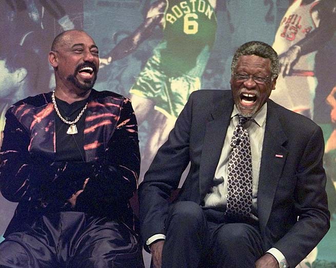
There has been a long-standing debate in basketball circles: who was the superior player, Wilt Chamberlain or Bill Russell? These two titans dominated the NBA in the 1960s, setting records, and altering the course of the league. While Russell’s Boston Celtics frequently bested Chamberlain’s teams, leading to a more decorated career in terms of championships, does that definitively prove Russell was the superior player? Perhaps not. In this blogpost, we’ll make a case for Chamberlain as the superior individual player over Russell.
Unparalleled Individual Statistics
When comparing individual statistics, Chamberlain’s numbers are nothing short of staggering. He remains the only player to average 30 points and 20 rebounds for his entire career, and his 1962 season, in which he averaged 50.4 points and 25.7 rebounds per game, is arguably the greatest single season in NBA history. He also owns the record for the most points in a single game, with an astounding 100. While Russell was no slouch on the stats sheet, Chamberlain’s numbers eclipse Russell’s in nearly every individual category.
Versatility and Adaptability
In addition to his dominant scoring and rebounding, Chamberlain was an extraordinarily versatile player. In the 1967-68 season, he led the league in assists, a testament to his all-around skills and ability to adapt to his team’s needs. Furthermore, he had an uncanny ability to stay on the court, often playing the full 48 minutes. On the defensive end, while blocks were not officially recorded during his career, anecdotal evidence and unofficial tallies suggest Chamberlain was one of the most dominant shot-blockers in history.
Dominance Over Russell in Head-to-Head Matchups
While Russell’s Celtics often came out on top in their battles with Chamberlain’s teams, the individual matchup between the two centers was a different story. Chamberlain averaged 28.7 points and 28.7 rebounds in games against Russell, both better than his career averages. This shows that when directly facing Russell, Chamberlain elevated his game, underscoring the point that team success does not necessarily correlate with individual superiority.
Impact on the Game
Chamberlain’s impact on the game of basketball extended beyond his personal achievements. His sheer dominance forced the NBA to change several rules, including widening the lane and adjusting rules on inbounding and free-throw shooting. This is a testament to the profound impact Chamberlain had on the sport.
Bill Russell was undoubtedly a phenomenal player and an exceptional leader, leading the Celtics to an unprecedented 11 championships in 13 seasons. His defensive prowess and unselfish play set the gold standard for the league. However, the case for Chamberlain as the superior individual player is compelling when considering his astounding statistical achievements, versatility, and dominance over Russell in their individual matchups.
The Chamberlain vs. Russell debate will undoubtedly continue as long as the game of basketball is played. In the end, perhaps it is enough to say that they were both exceptional players who shaped the sport in their own unique ways. Still, through this lens, the argument can indeed be made that Wilt Chamberlain was the better player.
Some pageant results fade the second the crown lands.
This one never did.
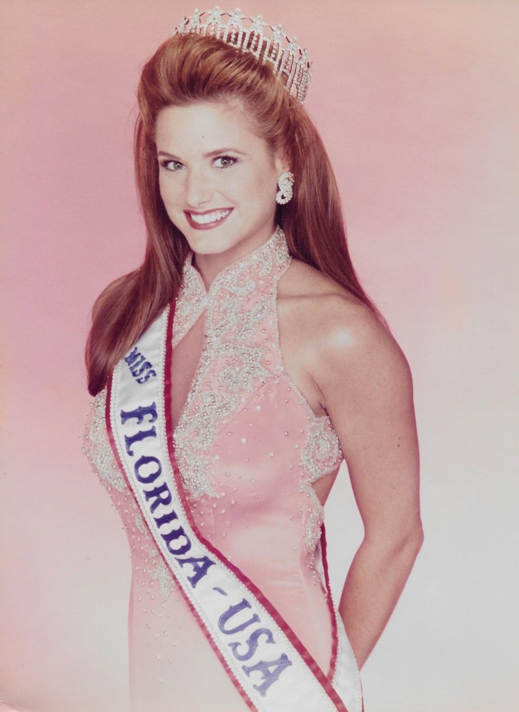
If you watch Miss USA 1997 back now, the obvious winner is not subtle. Angelia Savage of Florida looks like the strongest contestant in the field for most of the night. She has the body, the stage presence, the control, the ease. She looks like the woman to beat because, for most of the broadcast, she is.
And then Brook Lee wins.
To be clear, this is not a “Brook Lee was a fraud” argument. She wasn’t. She was smart, funny, polished, and she went on to win Miss Universe, which is a pretty serious rebuttal to anybody trying to dismiss her. She was excellent.
I just don’t think she should have won Miss USA 1997.
I think Angelia Savage should have.
What made Angelia stand out
The old version of this argument leaned too much on generic praise. “She was graceful.” “She was poised.” Fine. So was half the top ten. That doesn’t get you anywhere.
What made Angelia different was that she consistently looked like the most complete package in the competition.
She won Best in Swimsuit. That matters. Not because swimsuit is the whole competition, but because pageants have always rewarded a certain mix of athleticism, confidence, and command, and Angelia had all three. She didn’t just look fit. She looked fully in control. There was no hesitation in her movement, no sense that she was trying to survive the moment. She looked like she belonged there.
That same confidence carried into the rest of the night. In evening gown, she didn’t disappear behind the dress. In interview, she came across as natural instead of overprocessed. That sounds like a small thing until you watch enough pageants to realize how rare it is. A lot of contestants can deliver a clean answer. Fewer can make you feel like you’re seeing the actual person and not just the pageant software running behind their eyes.
Angelia had that.
And by the time the field narrowed, she felt like the contestant with the strongest overall momentum.
That’s the key point. My argument is not that she had one killer moment that got ignored. My argument is that she put together the best total performance and should have been crowned because of it.
Where the pageant turned
Miss USA 1997 wasn’t judged in a vacuum. The whole broadcast was hanging under the cloud of the Alicia Machado controversy. The reigning Miss Universe had been publicly criticized for her weight, and that story had become the pageant story whether anybody wanted it to or not.
Once that happens, the competition stops being only about who is performing best. It also becomes about who can best answer the question the culture wants answered.
Brook Lee got that question, and she knocked it out of the park.
That’s the uncomfortable truth at the center of this pageant. Brook didn’t steal anything. She hit the exact moment the show wanted. She gave the answer that fit the climate, fit the controversy, fit the broadcast, and fit the role. It was warm, quick, politically smart, and impossible to argue with in the room.
And that was that.
The problem, if you’re making the case for Angelia, is that the outcome suddenly hinged less on the whole competition and more on one late-stage communication test built around the biggest talking point in the pageant universe.
Brook was brilliant in that spot.
Angelia never got that spot.
She had already answered her on-stage question earlier. By comparison, it was just less consequential. Less loaded. Less built for the kind of answer that changes the energy in the building.
That’s really the crux of it. I don’t think Angelia lost because she was weaker. I think she lost because the pageant’s most important moment turned into a very specific kind of messaging contest, and Brook Lee happened to be exactly the right contestant for that moment.
That’s a real skill. I just don’t think it should have outweighed the rest of the competition.
Why I still side with Angelia
If you score Miss USA 1997 as a full-night competition, Angelia Savage still makes the most sense to me.
She looked stronger physically. She looked stronger in total stage command. She looked like the contestant with the clearest sense of herself. And most importantly, she looked like the woman who had done the most across the full competition to earn the title.
That doesn’t mean Brook Lee was some fluke. She wasn’t. It means the pageant rewarded the contestant who won the most important late moment instead of the contestant who had earned the title across the full night.
That distinction matters.
Pageants always pretend to be holistic until they aren’t. They tell you the whole competition matters, and then one answer, one question, one stray wobble, one lightning-strike moment suddenly outweighs two hours of work. Sometimes that’s fair. Sometimes it’s just how television works.
Miss USA 1997 feels like one of those nights where television won.
And television, to be fair, picked a strong winner. But I still think it passed over the stronger competitor.
What I don’t want to overclaim
I also think it’s worth being honest about the limits of this argument.
I don’t think Angelia was robbed in some conspiratorial sense. I don’t think the judges were insane. And I definitely don’t think Brook Lee’s later success should be brushed aside just because it complicates the thesis.
If anything, Brook going on to win Miss Universe makes this more interesting, not less. It proves the judges weren’t hallucinating. She had the goods.
But it still doesn’t settle the narrower question of who should have won Miss USA 1997.
For me, that’s Angelia. Not as a consolation prize for being memorable. Not as a “better on the night” footnote. As the woman who should have actually gotten the crown.
Why this one still bugs me
I know this is niche. Believe me, I know.
But some results linger because they expose the difference between “who won” and “what people saw.”
Miss USA 1997 is one of those results.
If you only read the winner list, it looks settled. Brook Lee won. End of story.
If you watch the pageant, it feels messier than that. You see a contestant in Angelia Savage who, for long stretches of the night, looks like the surest bet in the room. You see a pageant that gradually bends toward one question, one controversy, one answer. And you see the crown go to the woman who best answered the moment instead of the woman who, in my view, had earned it.
That is why people still argue about it.
And honestly, I think they should.
Because sometimes the official result is defensible and still wrong.
Gilligan’s Island, a beloved sitcom that aired from 1964 to 1967, has left an indelible mark on American pop culture. The show’s premise was simple yet captivating: seven people stranded on an uninhabited island after their boat, the S.S. Minnow, was caught in a storm. The castaways, each with their unique personalities and quirks, made the show a delightful watch. However, one character stands out from the rest, and that is Thurston Howell III, or as he is more affectionately known, Mr. Howell.
Mr. Howell, played by the talented Jim Backus, was the millionaire on the island. He was a character of contradictions, a man of immense wealth stranded in a place where money held no value. Yet, it is these contradictions, coupled with Backus’s exceptional performance, that make Mr. Howell the best character on Gilligan’s Island.
Firstly, Mr. Howell’s character was a brilliant satire of the wealthy elite. He was a caricature of the upper class, with his ascot, yachting cap, and ever-present martini in hand. Despite being stranded on an island with no hope of rescue, he maintained his lavish lifestyle, even going so far as to bring a trunk full of money with him. His insistence on maintaining his millionaire lifestyle in the face of adversity was both humorous and a poignant commentary on the value (or lack thereof) of material wealth.
Moreover, Mr. Howell’s relationship with his wife, Lovey, was one of the most endearing aspects of the show. Despite his bluster and bravado, Mr. Howell was a devoted husband. He treated Lovey with respect and affection, a rarity for sitcoms of that era. Their relationship was a testament to their enduring love, providing a heartwarming contrast to the comedic chaos that often ensued on the island.
Additionally, Mr. Howell’s character development throughout the series was remarkable. He started as a self-centered, money-obsessed tycoon, but as the series progressed, he showed a softer, more compassionate side. He often used his business acumen to help the castaways devise plans for rescue or survival. This evolution of his character added depth and complexity, making him a more relatable and likable character.
Furthermore, Jim Backus’s portrayal of Mr. Howell was nothing short of brilliant. He brought a certain charm and charisma to the character that made him impossible to ignore. His comedic timing, coupled with his ability to convey a range of emotions, made Mr. Howell a standout character. Backus’s performance was so iconic that it’s hard to imagine anyone else in the role.
Finally, Mr. Howell’s catchphrases and mannerisms have become ingrained in pop culture. Phrases like “Lovey” and “You buffoon!” are instantly recognizable and have been referenced in various forms of media, attesting to the lasting impact of his character.
In conclusion, while all the characters on Gilligan’s Island contributed to the show’s success, Mr. Howell stands out as the best character. His satirical portrayal of the wealthy elite, his endearing relationship with Lovey, his character development, Jim Backus’s exceptional performance, and his lasting impact on pop culture make him the most memorable character on the show. So, here’s to Mr. Howell, the millionaire castaway who won our hearts with his charm and wit.
This blogpost was created with help from ChatGPT Pro
Data science is the process of extracting insights from data using various methods and techniques, such as statistics, machine learning, and artificial intelligence. Data science can help organizations solve complex problems, optimize processes, and create new opportunities.
However, data science is not an easy task. It involves multiple steps and challenges, such as:
Finding and accessing relevant data sources
Exploring and understanding the data
Cleaning and transforming the data
Experimenting and building machine learning models
Deploying and operationalizing the models
Communicating and presenting the results
To perform these steps effectively, data scientists need a powerful and flexible platform that can support their end-to-end workflow and enable them to collaborate with other roles, such as data engineers, analysts, and business users.
This is where Microsoft Fabric comes in.
Microsoft Fabric is an end-to-end, unified analytics platform that brings together all the data and analytics tools that organizations need. Fabric integrates technologies like Azure Data Factory, Azure Synapse Analytics, and Power BI into a single unified product, empowering data and business professionals alike to unlock the potential of their data and lay the foundation for the era of AI¹.
In this blogpost, I will focus on how Microsoft Fabric offers a rich and comprehensive Data Science experience that can help data scientists complete their tasks faster and easier.
The Data Science experience in Microsoft Fabric
The Data Science experience in Microsoft Fabric consists of multiple native-built features that enable collaboration, data acquisition, sharing, and consumption in a seamless way. In this section, I will describe some of these features and how they can help data scientists in each step of their workflow.
Data discovery and pre-processing
The first step in any data science project is to find and access relevant data sources. Microsoft Fabric users can interact with data in OneLake using the Lakehouse item. Lakehouse easily attaches to a Notebook to browse and interact with data. Users can easily read data from a Lakehouse directly into a Pandas dataframe³.
For exploration, this makes seamless data reads from One Lake possible. There’s a powerful set of tools is available for data ingestion and data orchestration pipelines with data integration pipelines – a natively integrated part of Microsoft Fabric. Easy-to-build data pipelines can access and transform the data into a format that machine learning can consume³.
An important part of the machine learning process is to understand data through exploration and visualization. Depending on the data storage location, Microsoft Fabric offers a set of different tools to explore and prepare the data for analytics and machine learning³.
For example, users can use SQL or Apache Spark notebooks to query and analyze data using familiar languages like SQL, Python, R, or Scala. They can also use Data Wrangler to perform common data cleansing and transformation tasks using a graphical interface³.
Experimentation and modeling
The next step in the data science workflow is to experiment with different algorithms and techniques to build machine learning models that can address the problem at hand. Microsoft Fabric supports various ways to develop and train machine learning models using Python or R on a single foundation without data movement¹³.
For example, users can use Azure Machine Learning SDK within notebooks to access various features such as automated machine learning, hyperparameter tuning, model explainability, model management, etc³. They can also leverage generative AI and language model services from Azure OpenAI Service to create everyday AI experiences within Fabric¹³.
Microsoft Fabric also provides an Experimentation item that allows users to create experiments that track various metrics and outputs of their machine learning runs. Users can compare different runs within an experiment or across experiments using interactive charts and tables³.
Enrichment and operationalization
The final step in the data science workflow is to deploy and operationalize the machine learning models so that they can be consumed by other applications or users. Microsoft Fabric makes this step easy by providing various options to deploy models as web services or APIs³.
For example, one option for users is they can use the Azure Machine Learning SDK within notebooks to register their models in Azure Machine Learning workspace and deploy them as web services on Azure Container Instances or Azure Kubernetes Service³.
Insights and communication
The ultimate goal of any data science project is to communicate and present the results and insights to stakeholders or customers. Microsoft Fabric enables this by integrating with Power BI, the leading business intelligence tool from Microsoft¹³.
Users can create rich visualizations using Power BI Embedded within Fabric or Power BI Online outside of Fabric. They can also consume reports or dashboards created by analysts using Power BI Online outside of Fabric³. Moreover, they can access insights from Fabric within Microsoft 365 apps using natural language queries or pre-built templates¹³.
Conclusion
In this blogpost, I have shown how Microsoft Fabric offers a comprehensive Data Science experience that can help data scientists complete their end-to-end workflow faster and easier. Microsoft Fabric is an end-to-end analytics product that addresses every aspect of an organization’s analytics needs with a single product and a unified experience¹. It is also an AI-powered platform that leverages generative AI and language model services to enable customers to use and create everyday AI experiences¹. It is also an open and scalable platform that supports open standards and formats, and provides robust data security, governance, and compliance features¹.
Data analysis and visualization are key components of business intelligence, and Power BI stands as a leading platform in this domain. A pivotal part of working with Power BI involves dealing with datasets. Unfortunately, it isn’t always easy to access or generate datasets that perfectly illustrate the capabilities of Power BI. This is where ChatGPT, OpenAI’s powerful language model, can lend a hand. Today, we’ll delve into how you can use ChatGPT to create intriguing sample datasets for use in Power BI.
Step 1: Understanding the Desired Data Structure
Before generating your data, it’s essential to understand the structure you require. In Power BI, data is often organized into tables that consist of rows (records) and columns (fields). For example, a simple customer database could contain fields such as CustomerID, Name, Email, Country, and Purchase Amount.
You can sketch out your desired table and decide the kind of data you need for each column. For instance, for a column like “Country,” you might want a mix of countries worldwide, while for “Purchase Amount,” you may need a range of numerical values.
Step 2: Defining the Data Parameters with ChatGPT
Once you understand the structure of the data, the next step is to translate it into a form that ChatGPT can generate. This would typically involve providing the model with examples or templates of what you want. For instance, if you are creating a dataset for customer analysis, you can instruct ChatGPT as follows:
    data_template = """
    {
    "CustomerID": "random alphanumeric string of length 6",
    "Name": "random human name",
    "Email": "random email",
    "Country": "random country",
    "Purchase Amount": "random number between 100 and 5000"
    }
    """
Remember, your instructions need to be as clear and specific as possible to generate the right type of data.
Step 3: Generating the Data
After setting the data parameters, you can now instruct ChatGPT to generate the data. If you’re using the OpenAI API, you can use the openai.ChatCompletion.create() method, passing in the model you’re using (for instance, ‘text-davinci-002’) and the data template you’ve defined. Your code may look something like this:
    import openai
    import json

    openai.api_key = 'your-api-key'

    response = openai.ChatCompletion.create(
      model="text-davinci-002",
      messages=[
          {"role": "system", "content": "You are a helpful assistant that's generating a data sample."},
          {"role": "user", "content": data_template},
      ]
    )

    data_sample = json.loads(response['choices'][0]['message']['content'])

    print(data_sample)
This code will generate a single record. If you want to generate more records, you can loop through the data generation process as many times as you need.
Step 4: Compiling and Formatting the Data
Now that you have the data generated, you can compile it into a dataset. Each generated record can be appended to a list which can later be converted into a DataFrame using pandas. Here is how it might look:
    import pandas as pd

    data_records = []

    # Assume you have generated n number of records
    for i in range(n):
        data_records.append(generate_data()) # generate_data function includes the data generation code from step 3

    # Convert the list to DataFrame
    df = pd.DataFrame(data_records)

    # Save the DataFrame as a CSV file for use in Power BI
    df.to_csv('sample_dataset.csv', index=False)
Step 5: Importing the Dataset into Power BI
After your CSV file is ready, you can now import it into Power BI. In Power BI Desktop, you can import your CSV file by navigating to “Home” > “External Data” > “CSV”. From here, you can start creating your visualizations and dashboards.
Here is the complete code as a single block for easier reference:
import openai
import json
import pandas as pd

def generate_data():
    # Define your data template
    data_template = """
    {
    "CustomerID": "random alphanumeric string of length 6",
    "Name": "random human name",
    "Email": "random email",
    "Country": "random country",
    "Purchase Amount": "random number between 100 and 5000"
    }
    """

    # Initialize the OpenAI API
    openai.api_key = 'your-api-key'

    # Create a chat completion with the model and data template
    response = openai.ChatCompletion.create(
      model="text-davinci-002",
      messages=[
          {"role": "system", "content": "You are a helpful assistant that's generating a data sample."},
          {"role": "user", "content": data_template},
      ]
    )
    # Parse the response to JSON and return
    return json.loads(response['choices'][0]['message']['content'])

# Initialize a list for storing your data
data_records = []

# Decide the number of records you want to generate
n = 100

# Generate n number of records
for i in range(n):
    data_records.append(generate_data())

# Convert the list to a DataFrame
df = pd.DataFrame(data_records)

# Save the DataFrame as a CSV file
df.to_csv('sample_dataset.csv', index=False)
This script will generate 100 records based on the data template, compile them into a DataFrame, and save it as a CSV file. You can then import this CSV file into Power BI. Remember to replace 'your-api-key' with your actual OpenAI API key. Also, ensure that you have installed the openai and pandas libraries, which you can do with pip:
pip install openai pandas
Wrapping Up
Creating compelling sample datasets for Power BI is crucial for demonstrating its capabilities and experimenting with various features. By leveraging ChatGPT, you can create datasets that are tailored to your specific needs and can offer varied insights when analyzed in Power BI.
It’s important to remember that while ChatGPT is a powerful tool, it’s not perfect. Be sure to verify and clean the generated data before using it in your Power BI projects to ensure accuracy in your data visualizations and analysis.
This blogpost was created with help from ChatGPT Pro