Advanced Time Intelligence in Power BI: Calculations and Comparisons

A critical aspect of business analytics is understanding patterns, trends, and insights over time. Microsoft Power BI offers robust time intelligence features to analyze data at various time dimensions such as year, quarter, month, week, and day levels. This blog post will dive into advanced time intelligence in Power BI, with a focus on calculations and comparisons.

Understanding Time Intelligence

Time Intelligence is a term used to describe modeling methods and functions in Power BI that allow us to perform time-related calculations like Year to Date (YTD), Month to Date (MTD), and compare results with prior periods such as Last Year Same Period (LYSP) and Percent Change. This can provide valuable insights into data trends and business performance.

Basic Setup

Before performing advanced calculations, ensure your data model is set up correctly. The two basic requirements for time intelligence calculations in Power BI are:

  1. A Date Table: Power BI requires a separate date table linked to your fact table(s) through relationships. This date table should be continuous and have no missing dates.
  2. Establish Relationships: The date table needs to be connected to your data using relationships. The relationships should be active and single-directional for the time intelligence calculations to work correctly.

Key Time Intelligence Functions

Total Year to Date (YTD)

This calculation is used to evaluate the total value from the beginning of the year up to the current date. The DATESYTD function can be used to create a YTD calculation:

Total Sales YTD = 
CALCULATE(
    SUM([Sales]),
    DATESYTD('Date'[Date])
)

Month to Date (MTD) and Quarter to Date (QTD)

Similar to YTD, MTD and QTD calculations evaluate the total from the beginning of the month or quarter up to the current date. You can use DATESMTD and DATESQTD functions respectively.

Previous Period

The earlier period’s data is often used as a benchmark. You can use functions like PREVIOUSDAY, PREVIOUSMONTH, PREVIOUSQUARTER, and PREVIOUSYEAR to retrieve the data from the previous period.

Sales Previous Year = 
CALCULATE(
    SUM([Sales]),
    PREVIOUSYEAR('Date'[Date])
)

Same Period Last Year (SPLY)

This calculation allows you to compare the current performance with the performance of the same period last year.

Sales SPLY = 
CALCULATE(
    SUM([Sales]),
    SAMEPERIODLASTYEAR('Date'[Date])
)

Making Comparisons

Once you have the calculations for the current period and the previous period (or the same period last year), you can create measures to make comparisons.

For example, to calculate the growth in sales compared to the previous year, you can create a measure like this:

Sales Growth = 
([Total Sales YTD] - [Sales Previous Year]) / [Sales Previous Year]

This measure will provide the sales growth in terms of percentage.

Advanced Time Intelligence Calculations

Moving Averages

Moving averages are used to smooth out short-term fluctuations and highlight longer-term trends. The averagex function combined with datesinperiod or datesbetween can be used to calculate moving averages.

12 Month Moving Average = 
AVERAGEX(
    DATESINPERIOD('Date'[Date], LASTDATE('Date'[Date]), -12, MONTH),
    [Total Sales]
)

Cumulative Totals

Cumulative totals or running totals are used to display the sum of a measure up to a certain date.

Cumulative Sales = 
CALCULATE(
    SUM([Sales]),
    FILTER(
        ALLSELECTED('Date'),
        'Date'[Date] <= MAX('Date'[Date])
    )
)

Comparing Non-Consecutive Periods

Power BI offers a great deal of flexibility to compare non-consecutive periods. For example, if you want to compare the sales of Q2 this year with Q4 last year, you can use the function DATEADD.

Sales Q4 Last Year = 
CALCULATE(
    SUM([Sales]),
    DATEADD('Date'[Date], -2, QUARTER)
)

In conclusion, Power BI offers a variety of time intelligence functions to cater to various business needs. With a proper understanding of these functions, you can perform complex time-based calculations and comparisons to gain deeper insights into your data. Remember, it’s not just about creating measures and visuals, but about uncovering meaningful information to aid decision-making. As always, practice makes perfect, so don’t hesitate to experiment with these functions in your Power BI reports.

This blogpost was created with help from ChatGPT Pro

Advanced Data Analysis with Power BI: Leveraging Statistical Functions

Microsoft Power BI is a powerful tool that helps businesses and individuals transform their raw data into actionable insights. One of its most powerful features is the ability to perform advanced data analysis through its comprehensive suite of statistical functions. This blog post will delve into using these functions effectively, giving you a better understanding of your data, and improving your decision-making process.

Let’s start by understanding Power BI a bit better.

Power BI: A Brief Overview

Power BI is a business analytics tool suite that provides interactive visualizations with self-service business intelligence capabilities. Users can create reports and dashboards without any technical knowledge, making it easier for everyone to understand the data. Power BI offers data extraction from multiple heterogeneous data sources, including Excel files, SQL Server, and cloud-based sources like Azure SQL Database, Salesforce, etc.

Leveraging Statistical Functions in Power BI

Power BI is capable of conducting high-level statistical analysis thanks to DAX (Data Analysis Expressions) – a library of functions used in Power BI, Analysis Services, and Power Pivot in Excel. DAX includes a variety of functions such as aggregation functions, date and time functions, mathematical functions, statistical functions, and more.

To start with, we will discuss some of the commonly used statistical functions and how to apply them.

1. AVERAGE and AVERAGEA

The AVERAGE function calculates the mean of a column of numbers. AVERAGEA does the same, but it evaluates TRUE and FALSE as 1 and 0, respectively.

Here’s an example:

AVERAGE ( Sales[Quantity] )
AVERAGEA ( Sales[Quantity] )

The first expression calculates the average of the Quantity column in the Sales table, ignoring any TRUE or FALSE values. The second expression, however, will include these boolean values.

2. COUNT and COUNTA

COUNT function counts the number of rows in a column that contain a number or an expression that evaluates to a number. On the other hand, COUNTA counts the number of rows in a column that are not blank.

COUNT ( Sales[Quantity] )
COUNTA ( Sales[Product] )

The first expression counts the number of rows in the Quantity column of the Sales table that contains a number. The second one counts the number of non-blank rows in the Product column of the Sales table.

3. MIN and MAX

MIN and MAX return the smallest and largest numbers in a numeric dataset, respectively.

MIN ( Sales[Price] )
MAX ( Sales[Price] )

The first expression finds the smallest price in the Price column of the Sales table. The second expression returns the highest price.

4. STDEV.P and STDEV.S

STDEV.P function calculates standard deviation based on the entire population given as arguments. STDEV.S calculates standard deviation based on a sample.

STDEV.P ( Sales[Price] )
STDEV.S ( Sales[Price] )

The first expression calculates the standard deviation of the entire population of prices in the Price column of the Sales table. The second calculates the standard deviation based on a sample.

Implementing Statistical Functions in Power BI: An Example

Let’s demonstrate the implementation of these statistical functions in Power BI with a hypothetical data set. Let’s assume we have a “Sales” table with the following columns: OrderID, Product, Quantity, and Price.

To calculate the average quantity sold, we would create a new measure:

Average Quantity = AVERAGE ( Sales[Quantity] )

We can then use this measure in our reports to get the average quantity of products sold.

To find out the number of unique products sold, we would use the COUNTA function:

Number of Products = COUNTA ( Sales[Product] )

Finally, to find out the standard deviation of prices, we would use the STDEV.P function:

Price Standard Deviation = STDEV.P ( Sales[Price] )

We can now use these measures in our reports and dashboards to provide a statistical analysis of our sales data.

Conclusion

Understanding statistical functions in Power BI can provide meaningful insights into data. With a broad range of statistical functions available in DAX, you can perform advanced data analysis with ease. This blog post has introduced you to the concept and shown you how to leverage these functions. However, the scope of Power BI’s statistical capabilities goes far beyond these basics. As you get more comfortable, you can explore more complex statistical functions and techniques to gain deeper insights into your data.

Remember, it’s not about the complexity of the analysis you’re performing but about how well you’re able to use that analysis to derive actionable insights for your business or organization. Happy analyzing!

This blogpost was created with help from ChatGPT Pro

Mastering Power BI DAX: Tips and Tricks for Advanced Calculations

Introduction

Data Analysis Expressions (DAX) is a powerful formula language in Power BI that allows users to perform advanced calculations and create custom metrics for their reports and dashboards. Mastering DAX can help you unlock the full potential of your data and provide valuable insights to support data-driven decision-making. In this blog post, we will cover essential tips and tricks for using DAX in Power BI, from optimizing performance to tackling complex calculations.

  1. Start with the basics: Understanding DAX syntax and functions

To master DAX, it’s essential to familiarize yourself with its syntax and basic functions. The syntax is similar to that of Excel, but it offers a more extensive set of functions tailored to data analysis. Some commonly used DAX functions include SUM, AVERAGE, COUNT, and MAX. Make sure you understand the purpose and application of these basic functions before moving on to more complex calculations.

  1. Use variables for complex calculations

Variables in DAX allow you to store intermediate calculations and use them in subsequent expressions. By utilizing variables, you can break down complex calculations into smaller, more manageable parts, making your DAX formulas easier to read and maintain. Variables can also improve performance by preventing redundant calculations.

Example:

SalesAmountVar =
VAR TotalSales = SUM(Sales[SalesAmount])
VAR TotalUnits = SUM(Sales[Quantity])
RETURN TotalSales / TotalUnits
  1. Use CALCULATE for context manipulation

CALCULATE is a powerful DAX function that allows you to modify the filter context for a given expression. It’s essential for creating complex calculations, such as time-based comparisons or conditional aggregations. By understanding how CALCULATE works and its interaction with other DAX functions, you can create advanced calculations that provide valuable insights.

Example:

SalesLastYear =
CALCULATE(
SUM(Sales[SalesAmount]),
SAMEPERIODLASTYEAR(Calendar[Date])
)
  1. Optimize performance with evaluation context

When working with large datasets, optimizing performance is crucial. To do this, you need to understand the evaluation context in DAX – the filter and row contexts. Filter context is determined by the filters applied to a report or visualization, while row context is created when iterating through rows in a table. Use functions like CALCULATE, FILTER, and ALL to manipulate the evaluation context and optimize the performance of your DAX formulas.

  1. Leverage time intelligence functions for time-based calculations

Power BI offers a robust set of time intelligence functions, making it easy to create time-based calculations such as Year-to-Date (YTD), Month-over-Month (MoM), or Year-over-Year (YoY) comparisons. These functions include TOTALYTD, DATESMTD, SAMEPERIODLASTYEAR, and more. Make sure to use a proper date table in your data model for accurate time intelligence calculations.

Example:

SalesYTD =
TOTALYTD(
SUM(Sales[SalesAmount]),
Calendar[Date]
)
  1. Practice, practice, practice

The key to mastering DAX is consistent practice. As you work with Power BI, challenge yourself to create more complex calculations and explore new DAX functions. Use online resources, forums, and tutorials to expand your knowledge and learn from others in the Power BI community.

Conclusion

Mastering DAX in Power BI is essential for creating advanced calculations and custom metrics that drive data-driven decision-making. By understanding DAX syntax, using variables, optimizing performance, leveraging time intelligence functions, and practicing consistently, you can unlock the full potential of your data and deliver powerful insights to your organization.

This blogpost was created with help from ChatGPT Pro and is dedicated to Marco Russo and Rob Collie.

Create your first table export report from a Power BI Dataset in Paginated Report Builder

Welcome back!

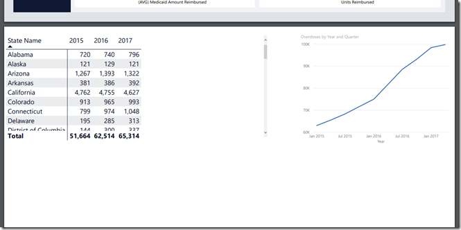
In last week’s post, I promised to walk you through how to create a simple table report in Power BI Paginated Report Builder from a Power BI dataset.  Why would someone want to do this, you ask?  Well, how many tables in your Power BI Desktop reports look like this?

image

So while you can interact with it in the browser and scroll to see all the rows, when you export it out to PDF, it looks like this.

image

Having tables in Power BI reports auto-expand when exporting is a common ask amongst Power BI users.  Unfortunately, the current behavior won’t be changing anytime soon.  With paginated reports, however, your tables can auto-expand across several pages upon export, and they’re designed for just this type of use case.  Let’s walk through how to build a paginated report for this table against the same Power BI dataset.

Make sure you’ve downloaded and installed Power BI Report Builder as a first step.  Once that’s done, create a new blank report as your project.

image

From there, right-click on the “Data Sources” folder and select “Add Data Source”

image

You have two options at this point –

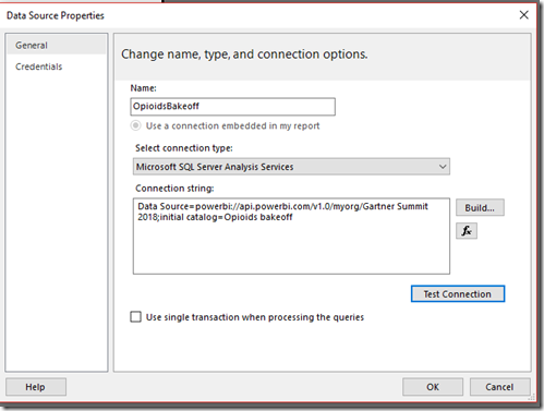
1. You choose SQL Server Analysis Services as your source and connect to your Power BI Dataset in the service.  (Currently, this requires your dataset be in a workspace backed by Power BI Premium, but this will work against datasets in non-premium workspaces in the near future.)  You’re doing so using the “XMLA endpoint” that was discussed in a recent announcement.  As Christian states in the post, use the following URL format to address a workspace as though it were an Analysis Services server name –

powerbi://api.powerbi.com/v1.0/myorg/[your workspace name]

myorg can be replaced with your tenant name (e.g. “mycompany.com”).

[your workspace name] is case sensitive and can include spaces.

If you’d prefer, you can easily copy the full URL you need from the dataset settings and paste that into your Connection string.  I’ll do that for my report –

image

My connection string looks like the following after pasting it in.  Power BI Report Builder will automatically place “Data Source=” in front of the connection string I’ve pasted in to make sure it works properly.

image

Click “OK” to save this data source in your report.

2.  Alternately, you can use a Power BI Desktop file locally as your SQL Server Analysis Services data source to create this report against by using the diagnostics port Microsoft documented in 2018.  This may help accelerate development in certain scenarios by allowing you to build this out when you’re traveling on a plane, etc, and also allow you to test performance of the paginated report in more advanced scenarios you want to tackle (I confirmed with Adam Wilson there was no issue with letting folks know about this).  Just make sure you change your connection string for your data source after publishing your Power BI Desktop file and prior to publishing the paginated report to your Power BI workspace using the information I just covered.

Now matter which option you’ve chosen, the tutorial I walkthrough proceeds the same way.

Next, right-click on the “Add Dataset” to add a new dataset to your report.

image

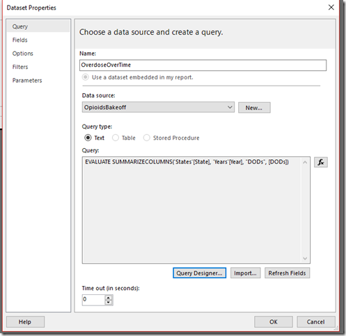
Datasets in paginated reports are a little different than those in Power BI reports you might be used to.  A dataset in a paginated report is just a single query that runs against the selected data source and returns data.  You can have several datasets in your report, but in this example, we just need one.

image

I’ll name my dataset, select the data source I want to run it against, and click the “Query Designer” to create my query I want to run and return data from.  As I mentioned on Twitter earlier this week, Paginated Report Builder has a visual designer that will craft the DAX query once I drag and drop the fields in I need.  I just need three for this particular query, and get the following result when I execute it.

image

Looks like I have everything, so I click OK and then save my dataset.

image

Now let’s build the table for our report.  Select the Insert tab, then click Table and choose to run the Table Wizard

image

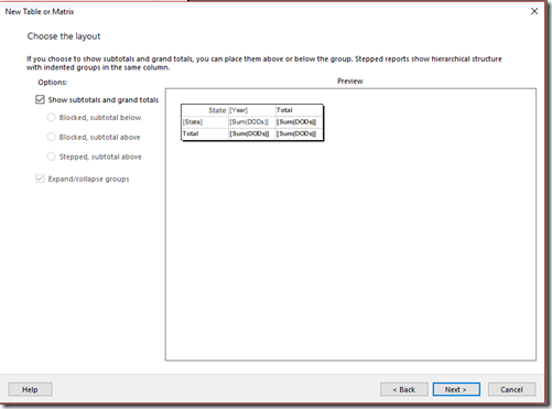
I select the dataset I just created, and drag and drop the fields into the groups accordingly.  I want each row have a “State”, and have each “Year” be a column.  My values are a simple sum of the “DODs” field.  This allows me to have subtotals and grand totals for my groups if I choose to do so.  I have what I need, so I click Next.

image

I’ll leave the “Show subtotals and grand totals” checked and complete the table wizard.

image

I’m going to delete the column group on the right of my table that says “Total” at the top by right-clicking on it.  With that change, my table looks like the following.

image

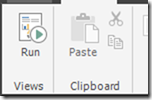
You don’t see data changing live when you’re designing the report like you do with Power BI Desktop.  Instead, it’s a similar experience to designing a Mail Merge document in Microsoft Word – you’re creating a layout of how you’d like your report to look, then feed the data from the data source to generate the report/document.  To see the report you’ve designed with your actual data, click “Run” from the toolbar under the Home tab.

image

Here’s what my report looks like.

image

I’ll export it to PDF to confirm it will auto-expand across multiple pages, and sure enough it does.

image

If you’ve stayed with me this far through the post, thank you and you’ve finished creating a simple table report against a Power BI dataset.  There’s clearly much more I could do to make this look prettier, but it isn’t necessary in this particular scenario for my users (which is, well, me).  In a follow-up later this month, I’ll have a short final post around publishing this to the service and linking to it from my Power BI report there.

Have a great weekend!

Use Outlook Shortcuts to organize your favorite Power BI Reports and Dashboards

image

I haven’t written in awhile, but wanted to get this up while it was still fresh in my mind (and had some time left at lunch).

Did you know Outlook had a shortcuts feature?  I didn’t (or at least I didn’t remember I did), and this video was the only one I could easily find on the topic.  Ostensibly, it’s used to create shortcuts to folders in Microsoft Outlook that you can quickly jump to.  However, as I found out, you can also use it to jump to web content, including content in Power BI!  Just follow these simple steps –

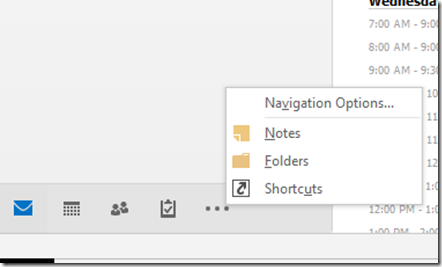
1. In Outlook (I’m using Outlook 2016), head to the shortcuts pane by finding the ellipsis at the bottom of your left-hand navigation area and choose “Shortcuts”
image

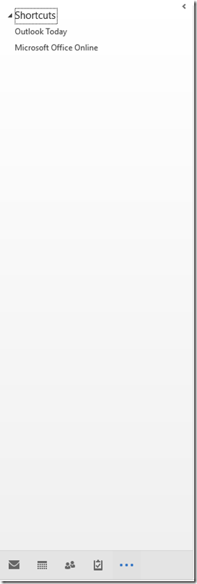
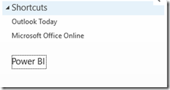
2. By default, you’ll see two shortcuts

image

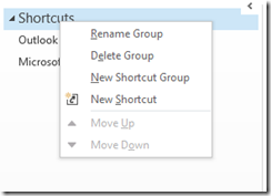
To start adding web pages as shortcuts, I want to have them organized, so I’m going to right-click on the “Shortcuts” top menu option and create a new shortcut group called “Power BI”.

image

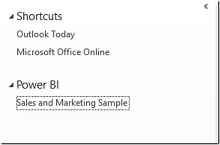
3. Once I’ve done that, it should look like this –

image

I can now add a web address as a shortcut, but I need to do this in a slightly different way than you might expect.  To do this, I’ll highlight the url in my browser that’s open like the following –

image

I’ll then drag this address under my new shortcut group in Outlook and give it a friendlier name (using my right-click menu option to rename the shortcut) so it looks like the following –

image

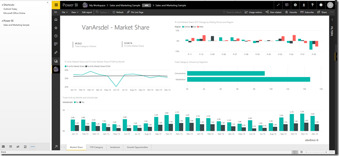
Now when I click the link, it looks like this in Outlook –

image

Not only that, it’s fully interactive and I can (seemingly) do all the same things with my dashboard or report I’d do in a separate browser

image

I have to be honest – I’m surprised this works as well as it does, and it’s much better than almost any other web page you might pull in there in my limited testing.  And maybe this isn’t that helpful to some folks, but I worked with a lot of former execs who would’ve LOVED to have been to simply to do everything right in Outlook.

Thanks for reading!

Tips when upgrading from the August preview to the October release of Power BI Report Server

Happy Thursday!

Many of you probably saw my blog post yesterday regarding the new release of Power BI Report Server.  I wanted to bring to your attention a couple additional items as it relates to that release, specifically when you’re upgrading from the August preview.  I am covering these in my session at PASS later today, but wanted to have something out before that time.

1. You must use the October 2017 version of Power BI Desktop that is optimized for Report Server with this release. You can download that October version directly here – https://www.microsoft.com/download/details.aspx?id=56136

2. If you have upgraded from August, any Power BI report that you used imported/embedded data in must be re-published. The simplest way to do this would be to download the file locally, open it using the October 2017 version Power BI Desktop for RS, and then save it back to the server.  You should then have no issues viewing the reports on your server.

While most folks won’t be affected by this scenario, some of our most passionate users (like those attending PASS Smile) will be, so please remember these tips as you upgrade.

If you’ll be at my session later today, I look forward to seeing you there!

Ten tips for the August Preview of Power BI Report Server

image

Happy Friday all!

Last week, we announced the latest preview of Power BI Report Server, which included new functionality like additional data source support and support for viewing Excel Workbooks.  As you’re trying these new features out, I wanted to highlight some items you might find useful as you get started testing –

1. Keep in mind Office Online Server requires you be part of a domain when you set it up on a server, or else installation will fail.  This is additional requirement beyond what Power BI Report Server requires on its own, where it can run on a server that isn’t domain-joined.  Keep that in mind if your demo environment is your personal laptop.

2. If you’re setting up an environment for test/dev/demo purposes, you can install both Office Online Server and Power BI Report Server on the same machine if you’d like.  This isn’t a supported scenario for production purposes, obviously, but might simplify the setup of your test/demo environment.

3. You can embed Excel Workbooks into other applications using the simple embed functionality at the end of your report URL – for example, I embedded the following live Excel workbook into a PowerPoint slide using the web viewer app from the Office Store, so I can interact with the report during presentations.

image

4. When installing the version of Power BI Desktop (August 2017) we shipped with the preview, it will normally upgrade the June 2017 version of Power BI Desktop for Report Server if you have that installed.  For some people, they’d like to run it side-by-side with the GA version of desktop for PBI Report Server and not upgrade it.  You can do that – just install the “x64” version if you are running the 32-bit version of desktop on your machine, or vice versa.  This should leave you with both versions (in addition to the version for the service if you have that installed as well).  Please note – this should only be done on machines you are using for testing or development purposes, as this isn’t an officially supported configuration.

image

5. If you have multiple versions of Power BI desktop installed, the behavior is designed to always default to the last version you installed when you double-click on a Power BI Desktop file to open it.  If you’d like to use a different version of the desktop you have installed on your machine with a particular report, make sure you open that first, then open the file you’d like to work with.

6. Have you tried the comments feature yet?  You can add comments to any report in Power BI Report Server (including Excel Workbooks) by clicking the comments icon on the right hand part of the screen and then add your comments, along with an attachment file if you’d like.

image

7. If you want to use a live Analysis Services connection with an Excel Workbook in Power BI Report Server, you’ll need to make sure the machine running PBI RS is an administrator on the Analysis Services instance for this to work, since we’re using EffectiveUserName in Office Online Server to make the connection.  John White talks more about this in his blog for SharePoint 2016 and OOS setup as well.

8. If for some reason you need to access the more advanced settings for Power BI Report Server via SQL Server Management Studio, you’ll need to connect using the reportserver endpoint, like in the following example –

image

9. One item you can turn on via Management Studio in Power BI Report Server is the “My Reports” functionality.  This is a simple way to enable access for your organization to a personalized area where users can store and author content in and have immediate access to the report server as long as they exist in Active Directory.  It’s a little different than “Favorites”, where users can tag reports that they want to see in a single view.  Definitely check out it if you haven’t already and see if it makes sense for you and your organizational needs.

10. Don’t forget to apply a brand package to your report server if you’d like to personalize it with your company/team/personal logo and colors!

With that, I’m happy to wish you a great Labor Day weekend (here in the USA, anyways), and thanks as always for reading!