What happened this week may go down as one of, if not the most, important weeks in the history of Microsoft Business Intelligence. Melodramatic nonsense from a Microsoft fanboy/employee? Hmm – maybe. Let me explain why I’m making this bold statement.
So, I’m not normal. Neither are probably most (if not all) folks reading this blog. That’s a good thing, because it makes us special. We’re blessed with what Rob Collie refers to as the “Data Gene”, and it’s why we love working with the Microsoft stack. It’s estimated (by Rob) that approximately 1 in 16 people have the data gene, in fact. Which means 15 out of 16 people don’t have it. They aren’t interested in crunching numbers all day, nor should they be. It isn’t their job. Which is why the presentation layer and integration with a productivity suite like Office is so important in any business intelligence solution – users need to be able to quickly and easily understand what’s being presented and take action on the information. These are themes I discussed at length in Part 1 and Part 2 of this series.
When I joined Microsoft in 2013 in my pre-sales role, I quickly learned two things –
1. The vast majority of people I was presenting to weren’t the ones reading every blog post from Marco Russo or Jen Underwood. They generally didn’t know or care what DAX was.
2. If they couldn’t see how they’d get business value from it personally, then they weren’t interested. This doesn’t mean they’re selfish – on the contrary, it means they’re pragmatic. And it is exactly how I’d feel if I was in their shoes.
Which meant if I spent a lot of time talking about how great the CALCULATE function was (and still is!) in Power Pivot, unless I had that one person in the room out of sixteen who had the data gene, I’d lost my entire audience right then and there. Forget about the sales context – the reason I wanted to do that job was summed up nicely in this tweet I saw from Hope Foley the other day –

Yep, sounds corny, but it’s true. And I knew I could help them solve their business challenges with our stack. So I wanted to be sure to highlight functionality which THEY were telling me would help them the most, not just what I thought would. Think back to the pre-Power BI era at Microsoft, which is when I joined – what two things do you think folks told me was the most valuable functionality I showed them?
1. The ability to export to PowerPoint from a Power View report in SharePoint was easily first
2. The decomposition tree in PerformancePoint in SharePoint was easily second
There wasn’t a close number three I could point to – at each customer presentation I did, if I showed these two pieces of functionality, they’d be the ones customers wanted to start using “tomorrow” because of the amount of value they thought it would bring their organizations. What usually happened when I finished was, the customers marched right from the presentation down to IT and demanded they deploy the latest version of SharePoint and Office in the organization so they could use this functionality. Naturally, IT said “Absolutely! We own these licenses already and we’ve been itching to do this. We’ll have you up and running in no time!” Then they joined the rest of the Care Bears on Gumdrop Mountain to celebrate their good fortune.
I’m guessing you figured out I was being facetious. For many customers, it was simply too much work for them to get all the pieces in place to take advantage of this functionality. This was frustrating, but completely understandable coming from where I’d been in “shadow IT”. So we only saw a fraction of the adoption you’d expect based on the interest shown in the presentation. Fast forward to this week and what was announced.
The first announcement came a week ago in the Power BI visualization contest. Fredrik Hedenström submitted his second entry in the contest – now, it would be hard to top his first (which of course I loved – I am sure you can guess why looking at this picture of it)

Go Frederik Go!
But he may have done just that. His entry this week was for a visual called Breakdown Trees. When I saw it, I smiled. Frederik basically took the decomposition tree from PerformancePoint and put it into PowerBI.
Power BI version

PerformancePoint version

Remember, this was one of two things our largest customers told me they saw providing the most value to their organizations when I showed it to them. And now, instead of just seeing it with AdventureWorks data being demoed, they could now be using this functionality, with their data, in the same meeting. That’s absurd (in a good way)!
Maybe you’re thinking “Pfft – that was over two years ago. I mean, Datazen didn’t even have an iOS app yet. Times change, man!”
I seriously doubt that people won’t want this functionality as much now as they did then, but I’ll concede the point for the sake of argument. The other announcement that came a few days later was even bigger than the first one.

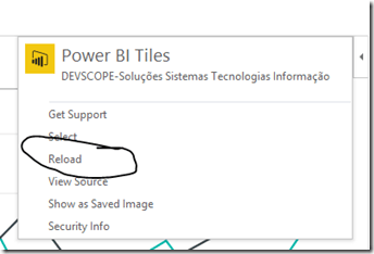
A company called DevScope created an Office Add-In that allows me to insert tiles from my Power BI dashboards into PowerPoint, Excel, or Access. I’ve talked about Office Add-Ins before in a previous article, which was one of my most popular posts to date. As I read through the blog post which showed me how to add the tiles, I thought to myself “It can’t possibly be this simple.” So I tried it and followed the steps in the blog –
1. Insert the Power BI tiles in the document


2. Click at the login button and authenticate with your Power BI credentials at the shown popup.

3. Select the Dashboard and the desired PowerBI tile:

I now had two questions –
1. Can I refresh the data? Yep

2. What if I send it to someone who doesn’t have the app? You still can, just choose the “Show as Saved Image” option.

OMG – this changes everything. Here’s why –
1. For two years, every organization I met with asked for this type of functionality in every meeting. That’s over 100 of the largest Microsoft customers in the world. Even after Power BI was introduced and became the focus of many of my conversations, they have the same ask. The ability to get their live dashboards into PowerPoint slides OR line of business apps.
2. The level of difficulty to get this setup for an organization has gone from “complex” to “trivial” if they’re running a newer version of Office. Many more customers are actively using Office 365 and 2013/2016 than were using it two and a half years ago, so that isn’t the barrier it once was.
3. Well, what if an organization is instead using Office 2010 as the standard? It used to be that would be an enormous blocker to even try Power BI. Now, it doesn’t matter for Power BI, since I can sign up and use that immediately regardless of Office version. But I wouldn’t be able to use the app, right? Replay that fanciful conversation the folks had with IT earlier – instead of needing to have setup
– SharePoint 2013
– SQL Server
– SQL Server Analysis Services,
– SQL Server Reporting Services
– PowerPivot for SharePoint add-in
– Office 2013 for the client machine
– Hardware or VM’s to run everything on
– The Silverlight add-in on the client machine
– Proper security integration, proper licenses, stakeholder buy-in, etc.
to get functionality they saw me demonstrate, I just need one machine with an updated version of Office (32 or 64-bit) to get this functionality. I can think of exactly two customers during my time in the field where they wouldn’t provision a single machine with the latest version of Office on it or allow the person to upgrade. In general, it wasn’t a big deal to get a couple folks using a newer version of Office to prove out the value of the solution. So I show them in the presentation they can do this. Then they sign up and do it right away with their Salesforce.com data, and the only thing preventing them using it in every PowerPoint presentation they create is a slower deployment of Office? That’s a much, much easier thing for them to get done, and I assure you, people will make the ask to do so just to get this.
4. This is the biggest one, and I am convinced of this – this functionality is so simple and so valuable, people will sign-up for Power BI to use this functionality even if they already own and use another tool. Forget about how easy it was to do – as far as I know, NONE of the other major self-service BI vendors I just mentioned can do what I just did at all, let alone that easily with three major pillars of the productivity suite that people use every day. It was that important to every business I’ve ever worked at, talked to, whatever. And because I don’t need every user to have the app downloaded, (remember, it still allows them to see the data as a static picture if they open it and don’t have the app), I’d be giving this an AWFULLY long look if I’m currently taking 30 snapshots of my Tableau/Qlik/Lumira/Whatever report and pasting them into a PowerPoint deck every week.
It’s not a perfect app – yet. If I have 50 tiles in my slide deck, yeah, refreshing each one at a time would get to be tedious (yet still much faster than my current option). To paraphrase Voltaire, “Don’t let perfect get in the way of good.” This app is really good as is, and it’s been available for all of two days. The only folks who wouldn’t get any value from this are the ones who can’t take advantage of Power BI at all. To them I say, read the latest blog post from my colleague Riccardo Muti this past week who shows off the newest functionality in SQL Server Reporting Services in SQL Server 2016 CTP 2.4, available now.
Yep, we added the ability to Export to PowerPoint there as well. And it looks GREAT when you export the report, thanks to the other enhancements they’ve made.
So, what do you think? Did Microsoft truly change the game this week? Before you answer, go ask some non-BI pros if they’d find the functionality I just described to you something they’re looking to use in their jobs. I think you may surprised just how valuable something so simple might turn out to be.
Enjoy your weekend!


