Pin to Win – Use Power BI to get updated Reporting Services data in your PowerPoint presentation

image

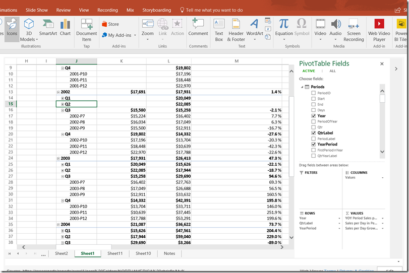
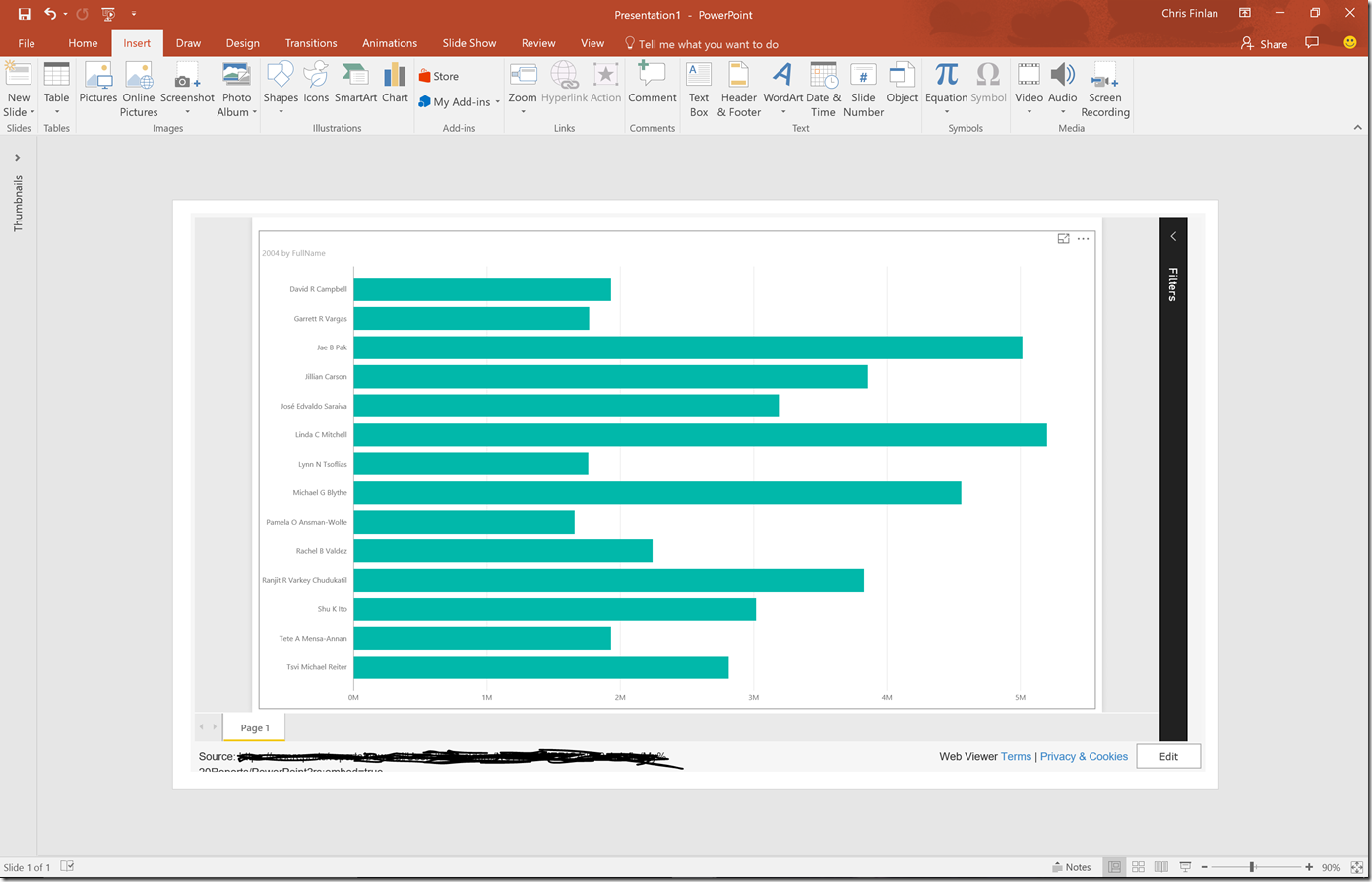
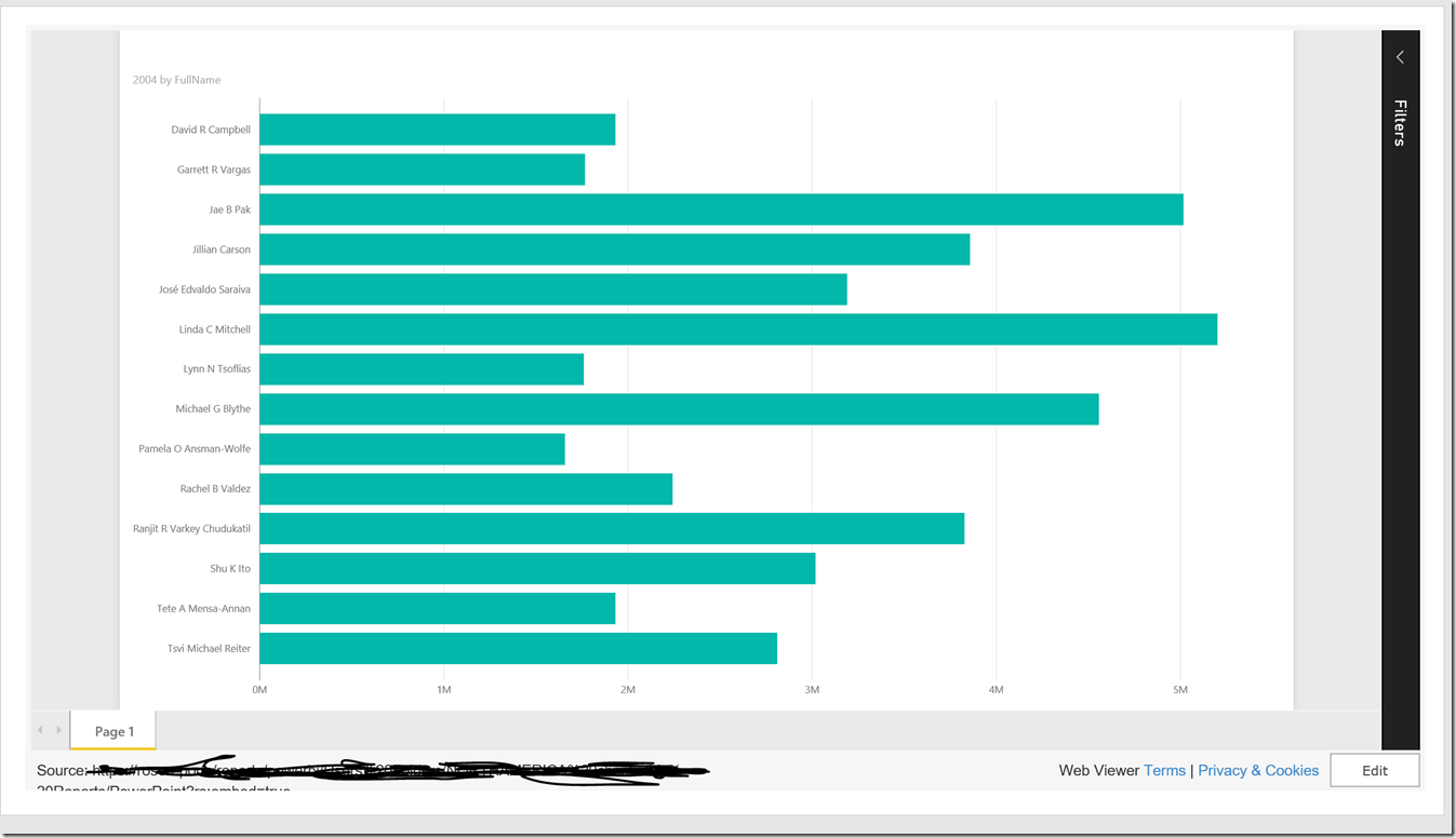
This was too cool not to blog about.  So the latest version of SQL Server Reporting Services supports Export to PowerPoint, but the data isn’t still live once it is exported.  Well, here’s a neat trick you can use to use elements from SSRS reports and have to data update in your PowerPoint presentations.  Use Power BI to make it happen!

1. Use the new pinning capability in Power BI to pin the report element from your Reporting Services report to your dashboard.

image

You’ll then see the SSRS element as a tile on your dashboard.

2. Use the new DevScope Power BI app in the PowerPoint presentation to add this element from your Power BI dashboard to your PowerPoint slide.  It’s an option just like every other tile in your Power BI dashboard to be selected and used.

firstpic

3.  The data gets refreshed hourly (the default option) in your Reporting Services report element in Power BI.  When the update happens, refresh the tile in PowerPoint and you’ll see the latest data and the time the data last refreshed!

image

This was an unexpected benefit of using the Power BI tiles in my PowerPoint presentation.  Heck, you could also do this in an Excel workbook!

Thanks for reading!

From Datazen to Mobile Reports in SQL 2016 – an FAQ on what it means for you

DatazenSSRS

If you follow this blog, you probably follow the news around the Microsoft Business Intelligence stack.  Which means you probably saw the post around the roadmap and what it means for Datazen.  But if you didn’t for some reason, here’s the scoop – a new report type, Mobile Reports, will be supported in SQL Server Reporting Services 2016 when it is released sometime next year and it will be based on Datazen technology.  So what does this mean for you, exactly?  Well, a number of questions around this announcement came up during PASS and on Twitter, so I thought I’d recap them here for folks who couldn’t attend or don’t follow me on Twitter.

When will we see Mobile Reports in a CTP for SQL Server  Reporting Services 2016?

By the end of this calendar year.  Our target is to deliver a public preview by the end of the calendar year.

Will the Datazen name be going away?

Yes, the Mobile Reports experience is all part of SQL Server Reporting Services in 2016 and beyond.  A new publishing app will be made available with updated branding and will be used for building mobile reports. At PASS Summit 2015 we demonstrated a single Power BI mobile application delivering a combination of report types from both SQL Server Reporting Services 2016 and the Power BI service.

Will I be able to migrate my existing Datazen dashboards to the new experience?

Yes, the plan is to give you a migration tool to assist you with that process and make it as seamless as possible.  This tool won’t be available at the same time as the first preview release, but we are planning to release it before the GA release.

Does this mean we will get support for WinAD groups when it moves into Reporting Services?

Yes!  As Riccardo Muti mentioned on Twitter, this is one of the ways Datazen and SSRS are better together.

Will brand packages be supported in the new Reporting Services experience?

Yes, they will.  More information around how that will work in the new service will be made available in the near future.
Fabrikam-Black

What functionality will be changed/updated when it is migrated into Reporting Services?

The way you build mobile reports, consume and interact with them on mobile devices or in a browser should basically be identical to the way you do so currently.  You’ll definitely see changes on the server side as it brought into SSRS so we can give you more of the things you’ve been asking for (like WinAD group support).  You’ll hear more about what exactly is being updated or changed as the release date gets closer.

How will it be licensed in SQL Server 2016 vs. today?

Since it will be part of Reporting Services, it’s reasonable to assume it will be licensed the same way Reporting Services is today.

Which product SKU will the Mobile Reports capabilities be available in for SQL Server 2016?

TBD.  There will be an announcement around which product SKU’s in 2016 it is available in at a later date.

Will the Mobile Reports capability be available in SharePoint integrated mode or Native Mode, or both?

Mobile Reports will be available in Reporting Services running in native mode only at 2016 GA, but can be surfaced in SharePoint using an iFrame similar to how you can do so now with Datazen.

There, that covers off basically everything that was announced or asked and answered at PASS concerning the future of mobile reports and Datazen.  You should be hearing additional details around some of these items either on the Datazen blog or the Reporting Services blog as the highly anticipated CTP release with this functionality approaches.  If you have additional questions you didn’t see addressed here, please leave a comment on the blog.  I might not be able to answer all of them, but will do my best to do so.

Thanks!

Game Change Two : Electric Boogaloo – Special PASS Edition of the Powerful Productivity Series

Fabrikam-Black

Game on.

That would have been the extent of the Microsoft Business Intelligence roadmap blog post if I’d written it (and is probably why I wasn’t picked to do so.)  But that was the takeaway that folks seemed to have after this week’s PASS Summit and after reading that post.  Chris Webb had a great write-up of the event where he said “In summary I can’t remember the last time I felt this positive about the future of Microsoft BI.”  Marco Russo tweeted on Wednesday “I’ve seen the most consistent, coherent, inspiring #msbi roadmap in 10 years.”

And the star of the show?  The Box.

No, not the movie from 2009 with Frank Langella and Cameron Diaz.  I’m talking about SQL Server 2016 and all the BI goodness that is coming with it.

The sessions given by Frank Weigel and Riccardo Muti were jammed with attendees (both had to stop people from coming in) who tweeted their excitement throughout with an almost religious fervor, especially when it came to SQL Server Reporting Services.  Think I’m exaggerating?  Look at this –

image

Sheesh – who knew the passion one would inspire by giving people the ability to re-position report parameters and export to PowerPoint.  Or maybe it was in response to the announcement that there will be support for Mobile Reports and KPI’s based on Datazen technology at GA in Reporting Services 2016

image
Boom goes the dynamite!

AND support for Power BI Desktop Reports in Reporting Services 2016 post GA

Boomshakalaka!

I could probably end the post right now with “Woohoo, we win!  We win!  Victory dance!  The box is back!”.  But if you remember my original Game Change post, as excited as we all are, are non-PASS attendees going to have this reaction?  I mean, I’m sure Telly Savalas would kill it every time saying “We’re all born bald, baby!” at the keynote of the annual meeting of the Bald Headed Men of America.

But how does that play when he goes on the road away from his fellow baldies?  Do the folks with hair get just as excited, or does someone stand up and say, “Wait a minute.  I thought you were dead?”  Which is exactly what I’m sure some customers will say when this is demoed to them for the first time.  Several jokes and tweets were even made during PASS about how SSRS finally looked like something built this century.

image
My dad loved his Ford Mustang as a kid!  Oh, now I get it . . .

This meant, however, sales folks and partners talking to customers about Microsoft BI generally avoided showing the product despite it having some incredibly powerful capabilities because “it looked like it fell out of an ugly tree and hit every branch on the way down”.  I actually had a customer say that about Reporting Services.  Or was it about me?  Either way, the meeting didn’t end well.

That meeting would have been much, much different now, for a number of reasons that I’ll call out two of –

1. Everyone loves Datazen.  Okay, I’m sure it’s not EVERYONE, and the product isn’t perfect.  But that’s the beauty of it being rolled into SSRS – where the product is missing certain features (lack of WinAD group support, etc.) is where Reporting Services is strongest.  And vice versa.  The interest in Datazen from Microsoft customers has been off the charts since they were acquired in April.  That’s due in no small part to the fact that the product demos incredibly well to the same people you’d never have dared showing Reporting Services to in the past, despite that functionality being something they were looking for (as I’ll demonstrate in the second point).

image
Hey, I can do that!

It makes perfect sense to bring these products together, and I’ll go into more details about what this all means for Datazen going forward in a separate post.

I’ll add one last thing, and this is the only time I will address this – if you heard the news that Datazen was being added into Reporting Services, and even for a moment had the word “ProClarity” pop into your head, STOP IT.  The difference between the two situations are so stark I can’t possibly cover off on all of them.  Even my pal AJ here at Microsoft, who came here in that acquisition ten years ago, laughed off the comparison.  But here’s two of the biggest differences:

Miljan Braticevic wasn’t here.
James Phillips wasn’t here.

Moving on.

2.  Let me tell you a true story  – one of my old customers brought in a solution from a competitor a couple years ago to replace another BI solution they had (NOT Microsoft’s).  This instance runs the majority of their reporting internally.  Their report looks like this –

image
Oh, I’m sorry.  I accidentally posted a picture of a paginated report in Reporting Services 2016, didn’t I?


Tricky, tricky

Yes, that’s because their report used functionality that could be done easily in Reporting Services using nothing more than Report Builder.  And their main method of distribution for these reports?

Subscription via e-mail.

And did I say one customer?  I meant to say MORE than one customer who had brought in our competitor’s product was using it solely to do reports like this!  I couldn’t believe it – all you heard was about how sexy and cool this other product was, yet the reports I saw people building with it were paginated reports often distributed via email!

So why were they meeting with me, you ask?  In essence, here’s what each of them said –

“Well, we’re a big Microsoft customer and we’ve run into some limitations with our current BI solution, so we were hoping to see if Microsoft had something that could provide them with a more holistic solution.  You know, something that would scale out to the entire organization, tie into our current security infrastructure, offered a great hybrid story that included both self-service and enterprise reporting options, plus mobile options for all device types and can easily surface the data in programs like Excel and PowerPoint.  Oh and it had to sit on-prem, because they weren’t ready to move everything to the cloud yet.  Did we have anything like that, either now or in the near future?

Your damn right we do.  Because the box is back.

Happy Halloween, everyone!

Perfect Data Poppycock – Part 4 of the Powerful Productivity Series

I wasn’t planning on this being part 4 of this blog series.  No, the plan was to do an end-to-end scenario using real data and a real business use case.  Instead, you’re getting a rant that I’m dressing up as a blog post.  The rant of a man who spent his Saturday afternoon doing what’s the hardest part of any BI project – actually getting the data and making sure it is clean and correct.

There’s been a number of new announcements recently around new analytics solutions from companies like Amazon, SAP and Tableau.  The announcements all had a similar theme – we’ve got a snazzy new product that will help people to easily explore, visualize and analyze their data.  And to show you how ground-breaking it really is, they give you a chance to try it using one of their pre-loaded sample datasets.  With just a few quick clicks, you too can make a bar chart that shows you how much ticket sales were for Jurassic World.  Or better yet, how many third class passengers died on the Titanic!

Yes, the best friend of BI pre-sales personnel everywhere, these perfect public datasets do a fantastic job helping tell the story you want customers to hear – just take your perfect dataset (preferably a single table on a spreadsheet), load it up and watch the magic happen.  And everyone uses these datasets – yes, including here at Contoso Microsoft.  It’s just the reality of doing demos – privacy concerns make using real company data very tricky, you don’t want the demo to go wrong, etc.  So like the latest Macklemore video, these demos look great at first glance, but trying to find any actual meaning around the information being presented is probably wasted energy.

That was why I wanted to finish off my perfect productivity series with a grand finale – use real data and a real business scenario that showcased the value of Power BI and Office 365.  And I had an excellent one – my wife runs an online business I help her out with from time to time.  She’s had some moderate success with it, but she’s never really used the data in any meaningful way, other than the normal tax stuff one has to do.  She suggested I look at the data to see if there were some things she could be doing to make more money at it.  Jackpot!

So yesterday, I sat down to dig into the data – surely, this was going to be a piece of cake.  All the data was in a central location, I knew the business, etc.  That’s when I ran into a data access problem.  The site she sells the items on only lets you get the records for the current month and the past three calendar months.  Since she had sales going back to October 2013, that wasn’t going to help.  I then tried pulling the data from a site called Terapeak, which I love to play with because it has historic sales data, but they too limit the number of records you can download.  Gee, what a surprise, central IT was preventing me from getting the data I needed to do my job . . .

After I snapped out of my shadow IT flashback, I did what I used to do in these situations.  I figured out how to work around the data access limitations.  I discovered the data was also available from PayPal, and those you could run for a custom time period.  Woohoo!  So I ran the report, downloaded the file, and opened it up in Excel to review the data before I got started.  That’s when the “fun” began.

The first problem was PayPal had two records for each item someone bought, one that reflected the item when it was in the shopping cart, the other when it was it actually paid for.  It looked like this –

image

Then I noticed there was stuff in the download that had nothing to do with the sales themselves, but were potentially for office supplies or the like.  Plus it had a bunch of extra columns, date formatted in a dumb way, etc.

No big deal for me – Power BI desktop and Power Query in Excel eat these types of problems for breakfast.  And unless I missed something in my BI 101 class, no snazzy visual or finger gesture on my tablet is going to make up for the fact my dataset from the company’s “single source of truth” is giving me complete garbage.  Oh, but it gets better – this particular report included all the listing information, including the listing title, but didn’t include the listing category, which I needed.  So I’d have to recreate that myself for the purposes of this report, based off of the item title.  Also, the publication year for the item being listed, which was very helpful for certain listings, was buried in with the main title text.  I needed to pull that out and make it its own column.  It was becoming clear that my grand plans to play Witcher 3 all afternoon were evaporating fast.

We’re now teetering dangerously close to Ken Puls/Bill Jelen/Rob Collie territory in terms of ability required to make this happen, and last time I checked, there weren’t folks like this littered across every department of companies I’ve spoken to (see my previous post for some context on that).  Unless of course, I’m simply muscling through the spreadsheet and typing values into new columns manually as I eyeball each line.  Which is EXACTLY WHAT 99% OF PEOPLE WHO THESE NEW TOOLS ARE MARKETED FOR WILL DO.  It’s going to be faster for the vast majority of people in the short term.  Or maybe you’re using Google Docs, or haven’t heard of Power Query, whatever.  But not ME.  No, I’m going to make the folks at PASS proud by writing this great M script and –

If you’re thinking that ends with the phrase, weep like a baby when you notice yet another data issue, you’ve obviously been on this goat rodeo before at a customer site.  As I went to start my data import, I looked more closely at the title field – in the report, if someone bought multiple items in the same transaction, it only lists it as a single transaction line item, with a summarized sales amount.  BUT, it has all the items bought as separate values in the item title field, separated by commas.  So it looked like this –

image
Sadly, Bo didn’t know profits.

I knew what each item’s sales price was for, because the prices were always the same for the same types of item – for example, an old book would be listed for $9.95, and old Xbox game would be $14.95, etc.  But I still had to break these records into individual line items and then adjust the value on each line to reflect what the price was for that item only, since the overall item total would be copied to each line.

Uncle.

I’m sure it’s possible to get an M script that would automate this, and I’ve done stuff like that before in SQL Server, but I wasn’t about to fiddle with it for the 175 or so rows I needed to clean up.  I sucked it up and did that part of it manually in Excel.  The rest of the data clean-up I outlined I did do in Power BI desktop, but it took some custom M script, two Ken Puls articles (this one is especially useful) and about 200 (!) steps.  Oh and about nine hours of my time.  And Geralt’s time.

But the pain was all worth it – my properly cleaned dataset contained some remarkable insights that I was able to light up in Power BI with some of the new custom visuals that were introduced last week.  And it also reminded me of what it’s like in the real world, because this scenario happens every day, in every company in almost every department.  It certainly happened in my old group more often than my boss coming to me with a perfect data export of Titanic deaths he was looking to throw a pie chart on.

Jen Underwood touched on this theme in her post asking if you’d bought a self-service BI fantasy.  I’d take that one step further – you might need to ask yourself if you’ve bought a corporate BI fantasy as well. Because for all the flaws people feel the Microsoft solutions might have, it’s the only one I’ve found was designed and consistently used as part of every solution here in the real-world, where data is messy or unavailable or both.  And we’ve got pretty great visuals as well – ever seen a Datazen dashboard or that cool fishbowl in Power BI?

Have a great week at PASS!

Datazen Friday Grab Bag Post – Windows 7, Support, Dashboard Staging, Training and a PASS tease

image

Happy Friday all!

I haven’t had a chance to post the last couple weeks, but with the PASS Summit coming next week, wanted to share a few quick items that have bubbled up, grab bag style!

Windows 7 Publisher now in GA – I know this is big news for a lot of folks.  If you’ve been using the preview version of this, make sure you download the updated app, which was made available earlier this week.

Where you can go for support – I’ve had this come up a few times recently.  You can send a request to support@datazen.com and you’ll get an auto-email response that will contain a number of FAQ’s and a link to file a ticket with the support team.  If the FAQ doesn’t answer your question, make sure you use that link to submit your support question that you get back in the e-mail.  I’d also suggest you link to the Datazen content portal, which has articles that apply to the vast majority of questions that come up.

Moving content between server/hubs – The topic of dev or staging environments for Datazen is one that people send me questions around.  The best way to handle this type of scenario right now is to create groups on the same hub for each staging area, and move the dashboards between those environments.  You can use the Datazen security options to hide the groups and dashboards as needed in each group, and you can change the groups you publish dashboards too, as long as they are in the same hub.  We’ve heard the feedback that people would like more robust options and will be looking to improve that experience as the product evolves moving forward.

Where can I get Datazen training? – For most folks, the tutorial videos posted on the Datazen site are more than sufficient to get started quickly and put together some amazing content.  If that’s not enough to meet your needs, I know some customers were looking at the course available from Blue Buffalo Press, as well as working with partners to help them meet their needs.

Is there a Datazen session at PASS next week?  Yes!  Paul Turley and I will be presenting at the PASS Summit – that’s the good news.  The bad news is, it’s in the last slot on Friday before Halloween.  So, I’m sure that will cut into attendance at least a little bit.  But for those who do stick around, I’ll promise you this – you’ll get a glimpse of Datazen vNext during the session!

Hope you have a great weekend, and I’m looking forward to meeting some folks at PASS next week!

Mini Post – Datazen Sample Brand Package

Yesterday on Twitter, there was a conversation around getting a sample Datazen brand package to use or look at.  I provided it yesterday in the context of that conversation, but happy to make it available here as well.  You can download it for your use from here – http://1drv.ms/1L4XptF

For more information about the Datazen brand packages, make sure you check out the official documentation.

Thanks!

Game Change – Part 3 of the Power BI and Office 365 Powerful Productivity Series

image
What happened this week may go down as one of, if not the most, important weeks in the history of Microsoft Business Intelligence.  Melodramatic nonsense from a Microsoft fanboy/employee?  Hmm – maybe.  Let me explain why I’m making this bold statement.

So, I’m not normal.  Neither are probably most (if not all) folks reading this blog.  That’s a good thing, because it makes us special.  We’re blessed with what Rob Collie refers to as the “Data Gene”, and it’s why we love working with the Microsoft stack.  It’s estimated (by Rob) that approximately 1 in 16 people have the data gene, in fact.  Which means 15 out of 16 people don’t have it.  They aren’t interested in crunching numbers all day, nor should they be.  It isn’t their job.  Which is why the presentation layer and integration with a productivity suite like Office is so important in any business intelligence solution – users need to be able to quickly and easily understand what’s being presented and take action on the information.  These are themes I discussed at length in Part 1 and Part 2 of this series.

When I joined Microsoft in 2013 in my pre-sales role, I quickly learned two things –

1. The vast majority of people I was presenting to weren’t the ones reading every blog post from Marco Russo or Jen Underwood.  They generally didn’t know or care what DAX was.

2. If they couldn’t see how they’d get business value from it personally, then they weren’t interested.  This doesn’t mean they’re selfish – on the contrary, it means they’re pragmatic.  And it is exactly how I’d feel if I was in their shoes.

Which meant if I spent a lot of time talking about how great the CALCULATE function was (and still is!) in Power Pivot, unless I had that one person in the room out of sixteen who had the data gene, I’d lost my entire audience right then and there.  Forget about the sales context – the reason I wanted to do that job was summed up nicely in this tweet I saw from Hope Foley the other day –
image
Yep, sounds corny, but it’s true.  And I knew I could help them solve their business challenges with our stack.  So I wanted to be sure to highlight functionality which THEY were telling me would help them the most, not just what I thought would.  Think back to the pre-Power BI era at Microsoft, which is when I joined – what two things do you think folks told me was the most valuable functionality I showed them?

1. The ability to export to PowerPoint from a Power View report in SharePoint was easily first
2. The decomposition tree in PerformancePoint in SharePoint was easily second

There wasn’t a close number three I could point to – at each customer presentation I did, if I showed these two pieces of functionality, they’d be the ones customers wanted to start using “tomorrow” because of the amount of value they thought it would bring their organizations.  What usually happened when I finished was, the customers marched right from the presentation down to IT and demanded they deploy the latest version of SharePoint and Office in the organization so they could use this functionality.  Naturally, IT said “Absolutely!  We own these licenses already and we’ve been itching to do this.  We’ll have you up and running in no time!”  Then they joined the rest of the Care Bears on Gumdrop Mountain to celebrate their good fortune.

I’m guessing you figured out I was being facetious.  For many customers, it was simply too much work for them to get all the pieces in place to take advantage of this functionality.  This was frustrating, but completely understandable coming from where I’d been in “shadow IT”.  So we only saw a fraction of the adoption you’d expect based on the interest shown in the presentation.  Fast forward to this week and what was announced.

The first announcement came a week ago in the Power BI visualization contest.  Fredrik Hedenström submitted his second entry in the contest – now, it would be hard to top his first (which of course I loved – I am sure you can guess why looking at this picture of it)
image
Go Frederik Go!

But he may have done just that.  His entry this week was for a visual called Breakdown Trees.  When I saw it, I smiled.  Frederik basically took the decomposition tree from PerformancePoint and put it into PowerBI.

Power BI version
BT_Screendump1.png

PerformancePoint version

Remember, this was one of two things our largest customers told me they saw providing the most value to their organizations when I showed it to them.  And now, instead of just seeing it with AdventureWorks data being demoed, they could now be using this functionality, with their data, in the same meeting.  That’s absurd (in a good way)!

Maybe you’re thinking “Pfft – that was over two years ago.  I mean, Datazen didn’t even have an iOS app yet.  Times change, man!”

I seriously doubt that people won’t want this functionality as much now as they did then, but I’ll concede the point for the sake of argument.  The other announcement that came a few days later was even bigger than the first one.

image
A company called DevScope created an Office Add-In that allows me to insert tiles from my Power BI dashboards into PowerPoint, Excel, or Access.  I’ve talked about Office Add-Ins before in a previous article, which was one of my most popular posts to date.  As I read through the blog post which showed me how to add the tiles, I thought to myself “It can’t possibly be this simple.”  So I tried it and followed the steps in the blog –

1. Insert the Power BI tiles in the document
image
image

2. Click at the login button and authenticate with your Power BI credentials at the shown popup.

3. Select the Dashboard and the desired PowerBI tile:image

image

I now had two questions –

1. Can I refresh the data?  Yep
image

2. What if I send it to someone who doesn’t have the app?  You still can, just choose the “Show as Saved Image” option.
image

OMG – this changes everything.  Here’s why –

1. For two years, every organization I met with asked for this type of functionality in every meeting.  That’s over 100 of the largest Microsoft customers in the world.  Even after Power BI was introduced and became the focus of many of my conversations, they have the same ask.  The ability to get their live dashboards into PowerPoint slides OR line of business apps.

2. The level of difficulty to get this setup for an organization has gone from “complex” to “trivial” if they’re running a newer version of Office.  Many more customers are actively using Office 365 and 2013/2016 than were using it two and a half years ago, so that isn’t the barrier it once was.

3.  Well, what if an organization is instead using Office 2010 as the standard?  It used to be that would be an enormous blocker to even try Power BI.  Now, it doesn’t matter for Power BI, since I can sign up and use that immediately regardless of Office version.  But I wouldn’t be able to use the app, right?  Replay that fanciful conversation the folks had with IT earlier – instead of needing to have setup

– SharePoint 2013
– SQL Server
– SQL Server Analysis Services,
– SQL Server Reporting Services
– PowerPivot for SharePoint add-in
– Office 2013 for the client machine
– Hardware or VM’s to run everything on
– The Silverlight add-in on the client machine
– Proper security integration, proper licenses, stakeholder buy-in, etc.

to get functionality they saw me demonstrate, I just need one machine with an updated version of Office (32 or 64-bit) to get this functionality.  I can think of exactly two customers during my time in the field where they wouldn’t provision a single machine with the latest version of Office on it or allow the person to upgrade.  In general, it wasn’t a big deal to get a couple folks using a newer version of Office to prove out the value of the solution.  So I show them in the presentation they can do this.  Then they sign up and do it right away with their Salesforce.com data, and the only thing preventing them using it in every PowerPoint presentation they create is a slower deployment of Office?  That’s a much, much easier thing for them to get done, and I assure you, people will make the ask to do so just to get this.

4. This is the biggest one, and I am convinced of this – this functionality is so simple and so valuable, people will sign-up for Power BI to use this functionality even if they already own and use another tool.  Forget about how easy it was to do – as far as I know, NONE of the other major self-service BI vendors I just mentioned can do what I just did at all, let alone that easily with three major pillars of the productivity suite that people use every day.  It was that important to every business I’ve ever worked at, talked to, whatever.  And because I don’t need every user to have the app downloaded, (remember, it still allows them to see the data as a static picture if they open it and don’t have the app), I’d be giving this an AWFULLY long look if I’m currently taking 30 snapshots of my Tableau/Qlik/Lumira/Whatever report and pasting them into a PowerPoint deck every week.

It’s not a perfect app – yet.  If I have 50 tiles in my slide deck, yeah, refreshing each one at a time would get to be tedious (yet still much faster than my current option).  To paraphrase Voltaire, “Don’t let perfect get in the way of good.”  This app is really good as is, and it’s been available for all of two days.  The only folks who wouldn’t get any value from this are the ones who can’t take advantage of Power BI at all.  To them I say, read the latest blog post from my colleague Riccardo Muti this past week who shows off the newest functionality in SQL Server Reporting Services in SQL Server 2016 CTP 2.4, available now.

Yep, we added the ability to Export to PowerPoint there as well.  And it looks GREAT when you export the report, thanks to the other enhancements they’ve made.

So, what do you think?  Did Microsoft truly change the game this week?  Before you answer, go ask some non-BI pros if they’d find the functionality I just described to you something they’re looking to use in their jobs.  I think you may surprised just how valuable something so simple might turn out to be.

Enjoy your weekend!

Mini Post – How to build a Datazen PowerBI Mashup Dashboard

image

Mini post for you all today – Looking to show off your Power BI and Datazen dashboards in a single view?  A quick and easy way to do this is to take advantage of the capabilities to use custom URL’s from your Power BI tiles and link them to Datazen dashboards.  You can add images of your Datazen dashboards, then add a custom URL to the pinned image.  That way, when someone clicks the image, a new window opens showing your Datazen dashboard or KPI.  How did I generate the image files for the Datazen dashboards?  From my previous post!

Combine Excel Online and Load on Demand to power up your Excel data source in Datazen

image

I hadn’t planned on a post today, but after watching the Philadelphia Eagles get their first win of the season, I was inspired to do something I’d first thought about a couple weeks back.  Specifically, I wanted to use an Excel document as a data source in my Datazen dashboard, but enable Load on Demand capabilities so I could take advantage of parameters.  I also wanted to see how that would work in combination with people just typing in data into the Excel sheets that are the data source.  How quickly would I see their changes in my Datazen dashboard?

Out of the box, Datazen allows you to use Excel files in a shared folder as a real time data source.  And in the post I did around combining Datazen dashboards with Power BI Q&A functionality, I first talked using the sync capabilities of OneDrive to sync an Excel file from my local drive to the Datazen server.  The thought was, that way if I refresh a data source locally, I can have it sync up to the server.  The issue I saw with using this as the solution for this scenario were two-fold –

1. I was the only person updating information in this scenario.  Ideally multiple people could make updates using Excel Online at the same time.

2. I couldn’t do parameters with the out of the box Excel data source in Datazen.

Well, what if I used the workaround I mentioned about how you could use Excel files as a data source for KPI’s?  Since that had you using Excel like SQL, maybe then I could use parameters.  Let’s give this a shot.

In my Datazen server, I’m going to create a new data source called Excel as SQL, using the instructions from the blog post I referenced –
image  I’m going to create an Excel file with two tabs – one has Category, Amount and Target along with some sample data.
image
The other just has Category and a single sample value.
image
I then save my file.  It’s now available to me either on the server or in a web browser via Excel Online, thanks to OneDrive.
image

On the Datazen server, I’m going to create two SQL queries to use.  The first one, called Data, looks like this –
image

You see I’ve setup a parameter called @Product to use – here’s what that looks like
image

I used a default value to make sure I get back at least one value, otherwise the Datazen Publisher won’t be able to build the data view properly.  Next, I’ll build my other query called FilterValues.  It’s pretty basic –
image
Now I can build my dashboard.  I’ll bring in two elements – a Selection list and a Number with Delta.
imageThen bring in both of the data feeds and hookup the data to the dashboard elements.
image
I’ll setup my parameter to be equal to what’s passed into my dropdown list.
image
Now I publish my dashboard.  When I hit it from a web browser or app, I get back what I’d expect to.
image
This is fine, but I’ll want to add more items on an ongoing basis.  If I try to open the document and make the changes directly on my desktop, the data source is locked and not available to Datazen –
image
But, if I instead make the changes in Excel Online, the changes get synced and my data source isn’t locked!  This is true even if I have multiple people adding items at the same time.  I’m going to update my Excel Online document by adding a number of new categories (as suggested by my children) –
image
How quickly these show up can vary – I’ve had it in as little as 5 seconds, and sometimes it’ll take up to a minute.  For example, these showed up by the time I finished typing the previous sentence.
image
And I’ll now update my data in the other sheet as well.
image
What’s cool here is I don’t need to refresh the page to see this new data, since it’s always going to back to the original data source thanks to Load On Demand.  Once my data shows up, my values are automatically updated when I change the dropdown.
image And notice I added the Seahawks data – I’ll never see that as a value if unless I add it to the dropdown as well.

This offers some great flexibility for folks to manage data and make updates this way.  You could also do multi-select values vs. a single value by changing your SQL statement and allowing multi-select in your dropdown list.

Thanks for reading everyone!

Throwback Thursday Fun – Use a Visual Studio LightSwitch App to enable search/auto-complete for large selection lists in Datazen

image

This is an admittedly goofy post, but maybe it points some folks in the right direction.  One question that comes up is around how can you better manage a large lookup list in Datazen.  Currently, the product doesn’t allow search functionality in the dropdown list.  There is a way to work around this, however.  Previously, I posted about how to set default selection values in Datazen dashboards viewed in a browser.  The next logical step here would be to build a custom app and pass the values to that url.  I did just that, and I built the app in Silverlight!

Why did I do it in Silverlight?  Well, I  figured for Throwback Thursday (and because it’s admittedly a hacky solution) I’d kick it old school and build a C# LightSwitch app.  And since I realize most folks aren’t looking to do Silverlight development these days, I won’t bore you with the normal code review and walkthrough.  Instead, I decided to post the app I threw together up in Azure so you can play around with it and see if inspires you (or makes you smile.  or weep).  Here’s what you do to give it a whirl –

1. Go to https://datazentbtapp.azurewebsites.net/desktopclient where you’ll be prompted to install the app locally on your machine.  There’s no security on it or anything (and I didn’t bother signing the .xap file).
image

2. You’ll see the little DatazenTBTApp logo on your desktop if you choose that option.  Double-click on it to open the desktop app.
image
3.  The app will open and you’ll see the only screen in the app –
image
4.  The dropdown list on the left contains over 2500 records to choose from, so it’s not something you can easily scroll through.  No problem – just type the first few letters in the auto-complete combobox in the app.  You’ll jump to the results that match what you’re typing.  I’ll start by typing “MGS” – I quickly jump to the matching results that start with MGS, and my dashboard updates automatically to give me the proper result –
image

That’s basically it – feel free to try typing in some different letters/words (obviously Fabrikam and Contoso are well represented in this product list), watch your dashboard update, and relive the magical year of 2010!

(And yes, I might do one in HTML5/JavaScript in a follow-up post sometime.)